Case Study
Designing an app for emotional overeaters

My Role
Target User
Tools
Client

Project Overview
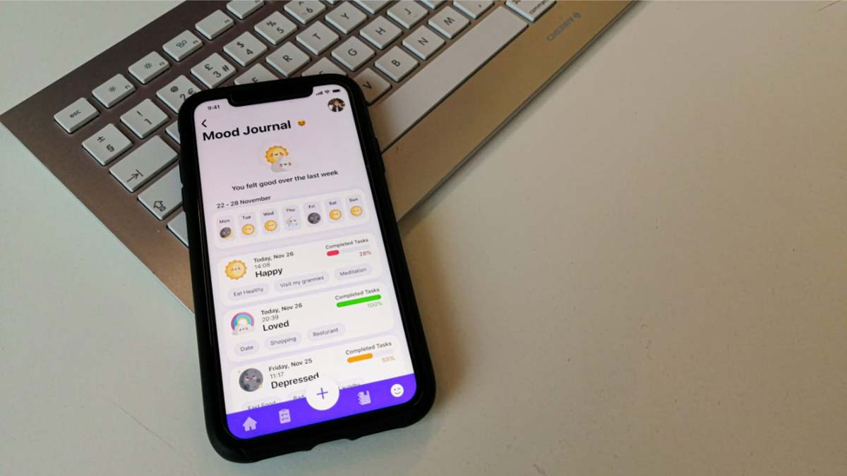
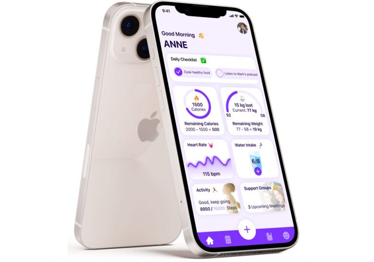
Healthy is an application that helps people manage their overeating, specifically emotional overeating, by tracking their moods and calories and involving them in support group sessions. On the other hand, it helps people be more organised by providing them with the ability to track their daily tasks.
MY CONTRIBUTION
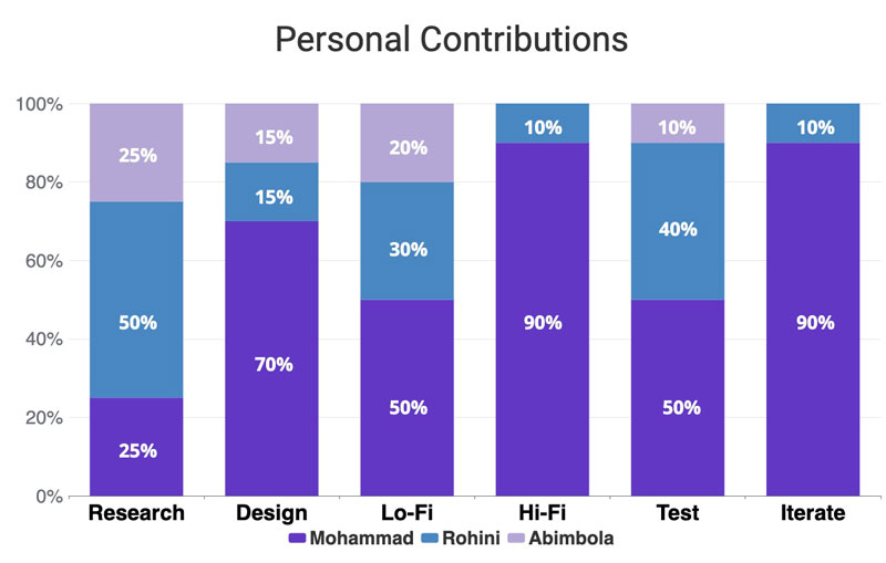
I started my work on this project as a User Experience Designer collaborating with two UX Designers, Rohini and Abimbola. In this project, most of the research is done by Rohini and Abimbola, and I have done most of the design and iteration process.
The details of our contributions are shown in the presented bar chart:


Process
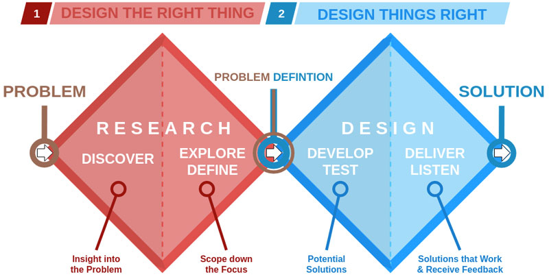
In order to utilise a user-based approach to the problem, we have looked to the Dubble Diamond User-Centred Design. This approach is an iterative design process in which designers focus on the users and their needs in each phase of the design process via various research and design techniques to create highly usable and accessible products for them.
The four stages of the Dubble Diamond User-Centred Design Methodology are Discover, Define, Develop and Deliver.
By applying each of these stages of User-Centred Design, we could re-frame the problem in a humanistic based space.
Discovery
First, we started the paper research to have more details about emotional overeating through the previous studies.
Second, We have done a competitor analysis for the most similar applications namely What’s Up, MyFitnessPal and Daylio Journal.
Third, we conducted some interview sessions to get familiar with our target users’ behaviours, needs, goals and problems.
Between 1.25 and 3.4 million people in the UK are affected by an eating disorder. It seems like a normal thing that people do when they’re stressed, anxious, bored, sad or even happy, but it is also a problem for some people who cannot control it and cannot find alternatives to managing their emotions. This problem is related to various scientific areas such as therapy, psychological science, endocrinologist, etc. Nowadays, emotional overeating is one of the most common eating disorders throughout the world, and it is found in the younger generation rather than, the older generations.
Competitors Analysis


Advantages:
- Users can track their diaries and habits
- Users can write down their notes
- User can track their moods
- User access to stress relief techniques
Disadvantages:
- Monotone user interface design can be boring
- The contrast ratio is not suitable in most parts of the application
- All texts are centre aligned and hard to read


Advantages:
- The shortcut button on the bottom menu is always accessible
- Easy to add meals/food
- Easy to see progress made
- User-friendly interface design
Disadvantages:
- Features are not well merged into an application
- Many complicated settings can be frustrating for the users


Advantages:
- Users can track their mood in pixels
- Users can see the whole year on one page.
- Includes a lot of shortcuts.
Disadvantages:
- Inconsistency in user interface design
- Lack of any animations
User Interview
We conducted initial individual user interviews to understand what the users wanted in the discovery stage and why. We chose a series of 6 questions, both qualitative and quantitative.
Style
Number
Duration
Initial Questions
- How many meals do you have during the day, including snacks?
- Apart from main meals, do you eat when hungry or emotional?
- Do you talk to other people about your eating habits?
- Can you specify in which moods you tend to overeat?
- What is your trigger to start overeating?
- In your opinion, how an application can help you to control your overeating?
Definition
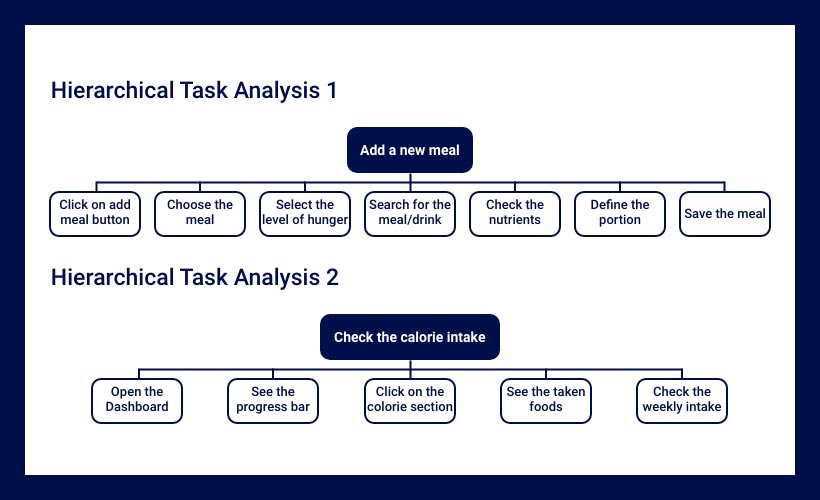
During this stage, we developed personas, solutions, scenarios and hierarchical tasks analysis diagrams (HTA) based on our paper and user research.
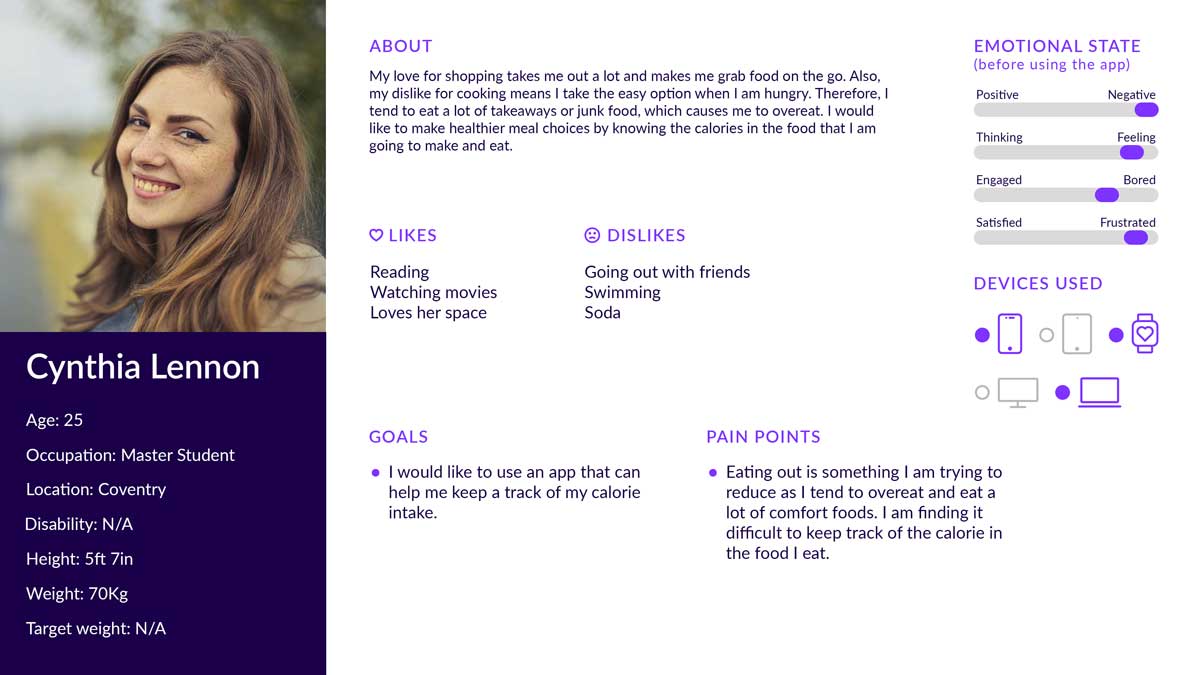
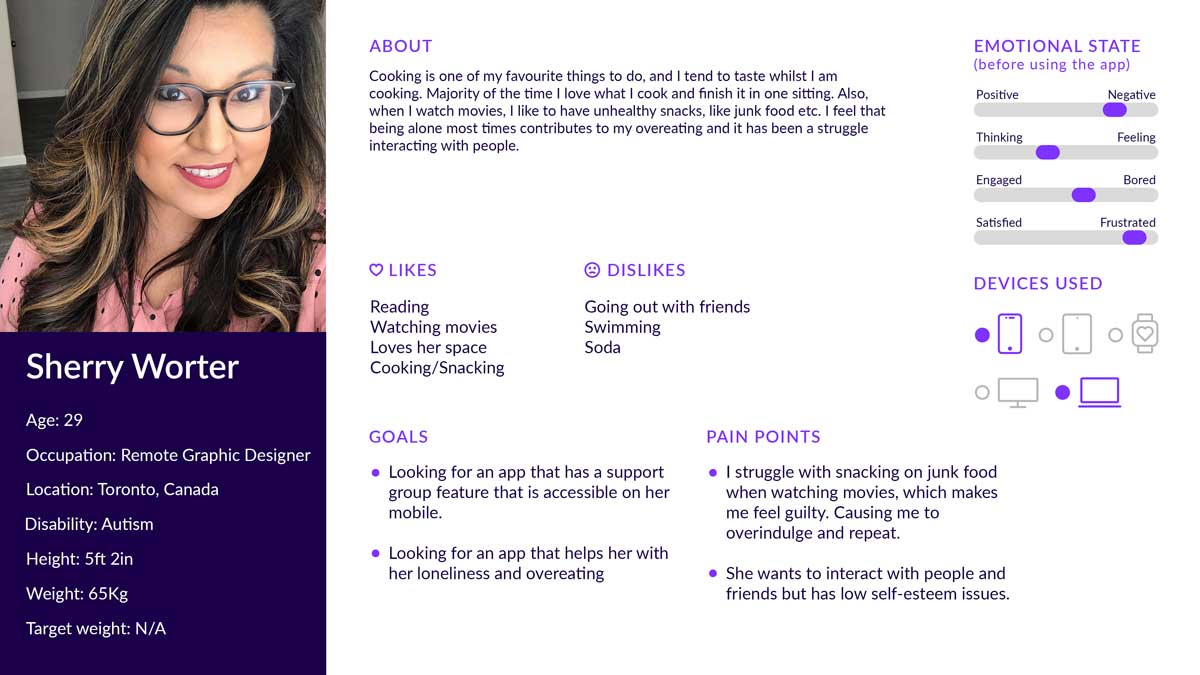
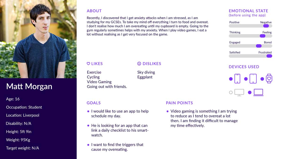
Gathering the data from the research and interviews, we were able to form three distinct user personas and their pain points, needs and goals.
Personas



Users Needs
- To find their emotional triggers and manage them.
- To eat the right number of calories each day.
- To track and reach goals.
- To talk about their feelings with others.
- To track their meals and check nutrient levels.
- To track their body parameters and activities.
Proposed solutions
- Tracking their calories throughout the day
- Tracking their mood
- Creating a support channel
- Providing nutritional / calorie levels of the meal
Scenarios and HTA diagrams
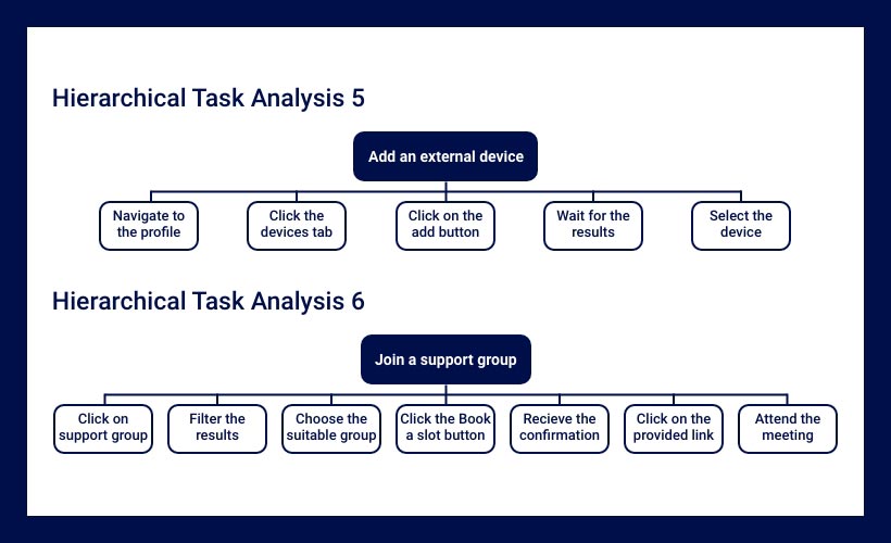
Developing the scenarios helped us map the scenarios and define some initial hierarchical task analysis diagrams based on the scenarios and proposed solutions.
The following content shows the defined scenarios and HTA diagrams.
Scenario 1
The user has a lot of difficulties trying to manage and track their calorie intake each day. They want to avoid food containing too many unhealthy calories and replace it with healthier options. The user wants an app that makes adding new meals easy and tracking their calorie intake each day.

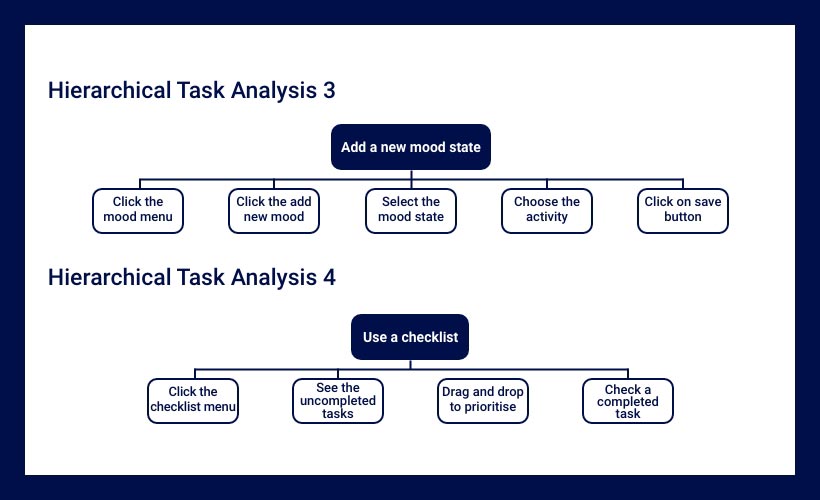

Scenario 2
Matt discovered his overeating is directly impacted by his stress and anxiety attacks. He wants to stop overeating. However, he has realised that it seems that his exams and homework make him anxious. He wants an application to find his triggers by recording his moods. In addition, he feels that tracking his daily tasks can reduce his stress.
Scenario 3
Thomas is a student struggling with overeating. He has a drawer filled with snacks, which he opens when bored and eats. He always has his smart device with him. He believes that having an app linked to his smart device will remind him to be more active. On the other hand, he likes to talk with someone about his overeating. He wants an app that can link to an external device to remind him about his activity and can chat with others about his eating habits.

Development
My contribution was significant in this stage and I have done the majority of Design decisions, Low-fidelity and High-fidelity prototypes to deliver the best user experience and interface design to the users.
Low-Fidelity Prototype
Sketching and Wireframing helped us iterate the design of main features and pages rapidly without any development barriers. In the process of the low-fidelity prototype, a few user experience issues were recognised in terms of information architecture and features’ relation. On the other hand, some new ideas have been explored to improve the application’s efficiency.
The following images show the initial and rectified sketches and wireframes.
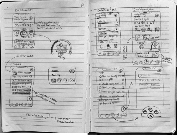

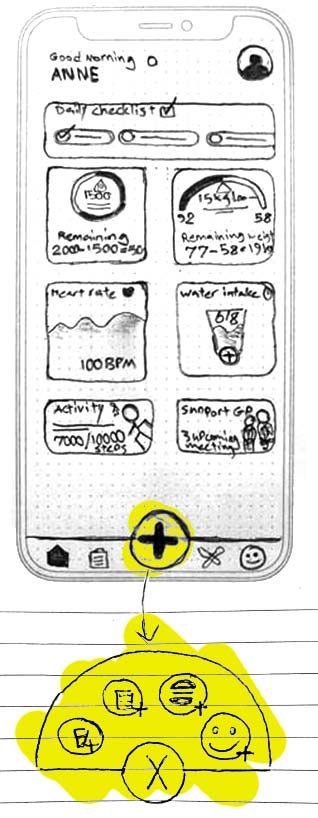
Initial thoughts on dashboard widgets and popup menu
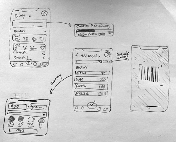

Initial sketches of the Diary page and add meal process
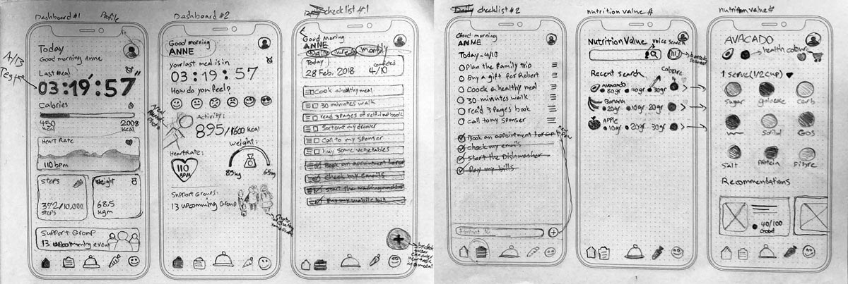

Sketch of different approaches for the dashboard and diary page
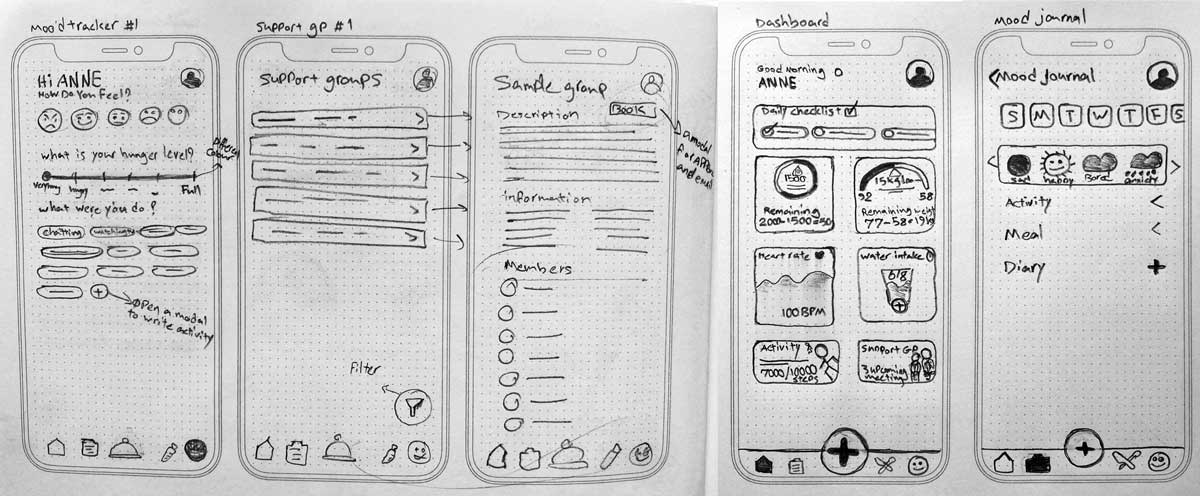

Rectified sketches of the Mood tracker and Dashboard
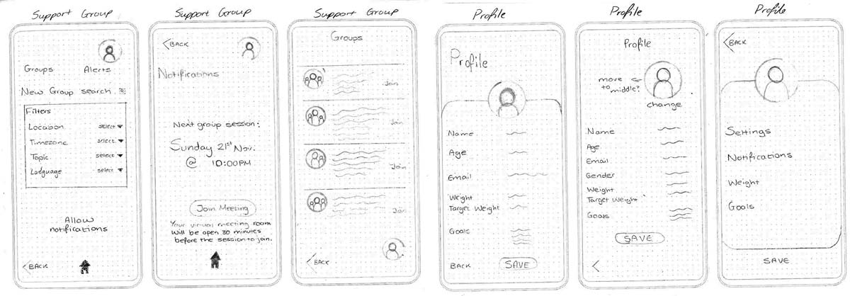

Final sketches of the Support groups and User profile
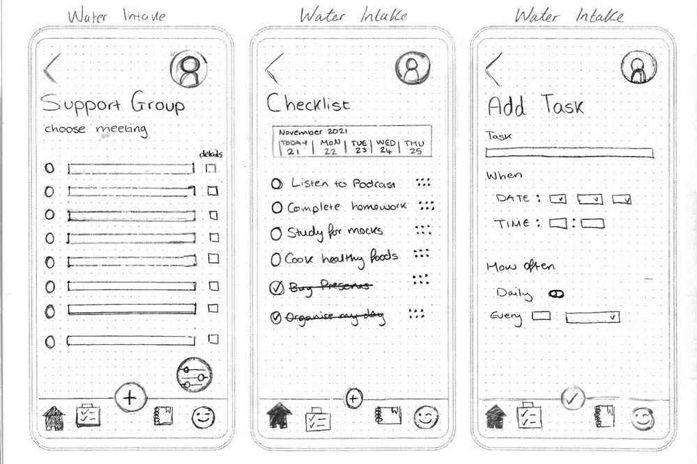

Final sketches of the Checklist page
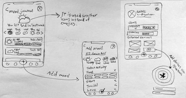

Rectified thoughts of Mood tracker visual interface design
Wireframes
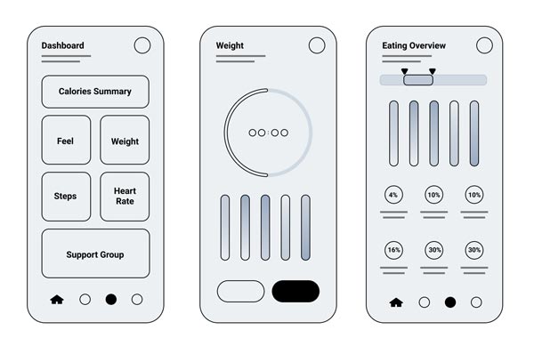

The Wireframe of the Dashboard and micronutrients
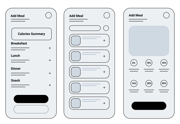

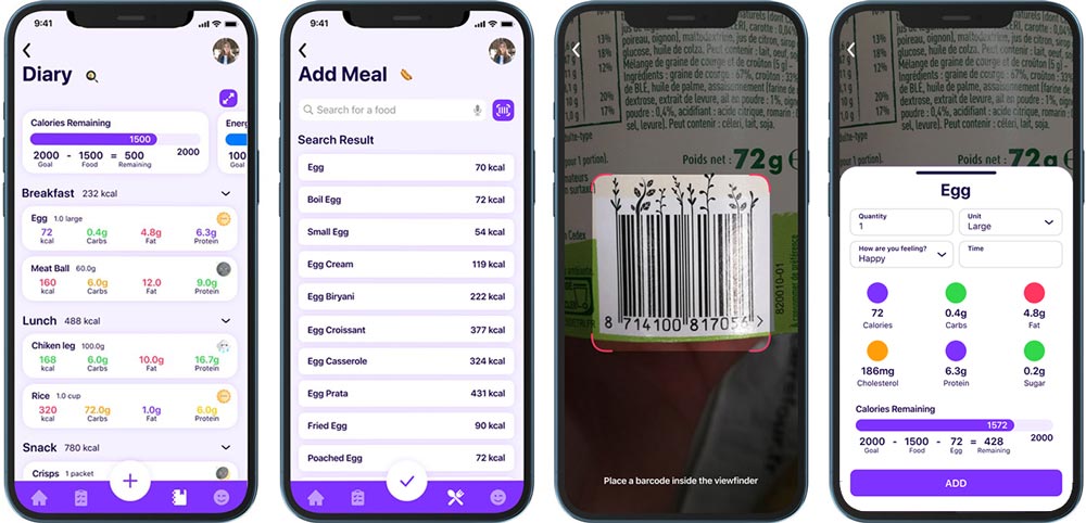
The Add meal process Wireframes
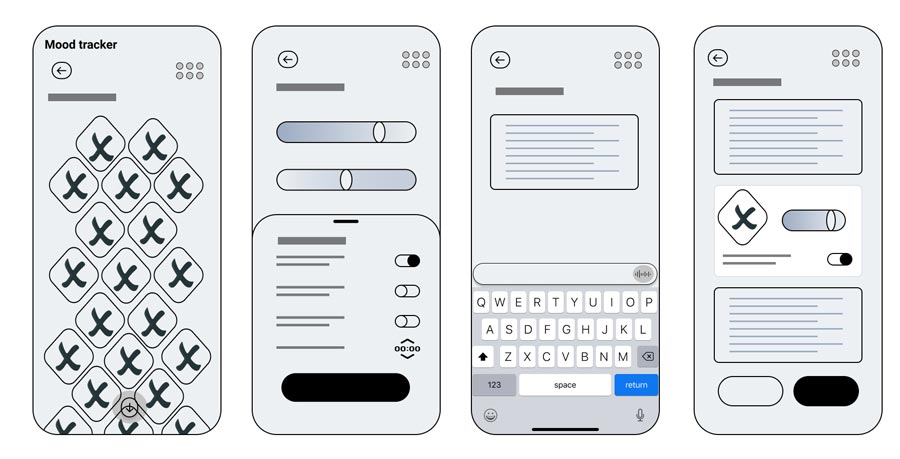

The Mood tracker wireframes
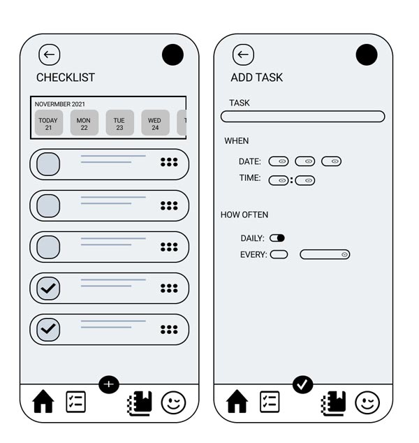

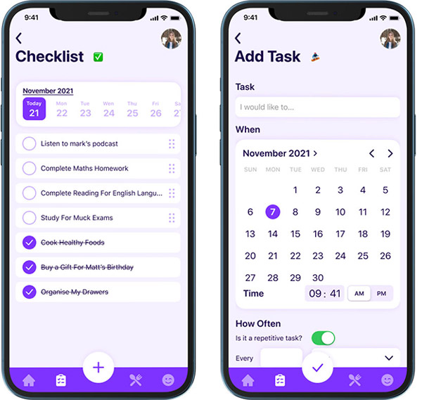
Checklist and add task process wireframes

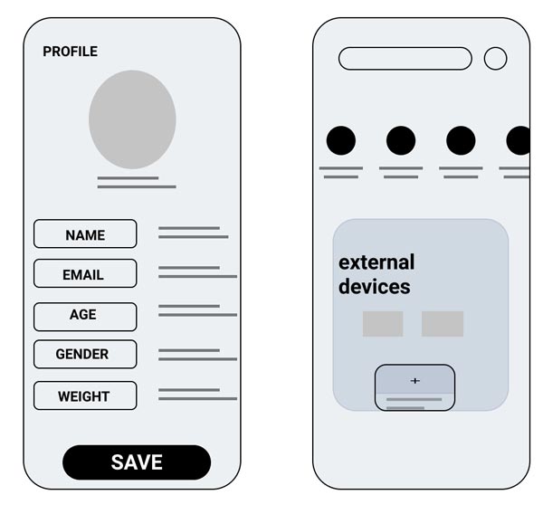
User profile page wireframe

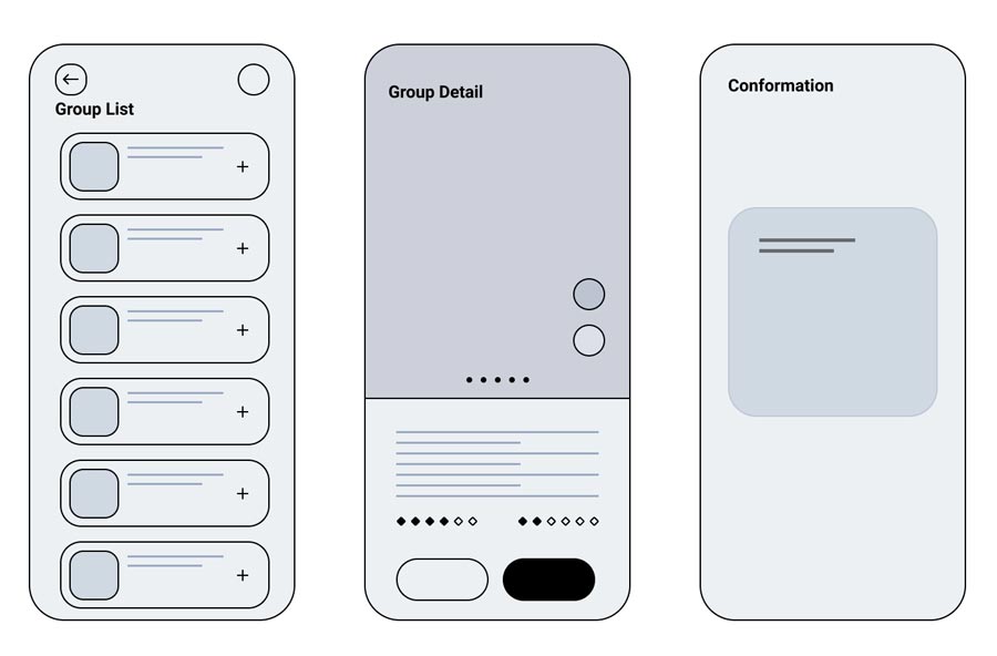
The Wireframes of Support group feature
Design Decisions
Since the target users of this application were recognised using iPhone based on the user interviews, the MVP version was focused on the iOS platform.
Many design decisions were made in terms of corporate identity and branding, I won’t cover the whole of them here but will walk you through a few design decisions I made.
Colour Scheme
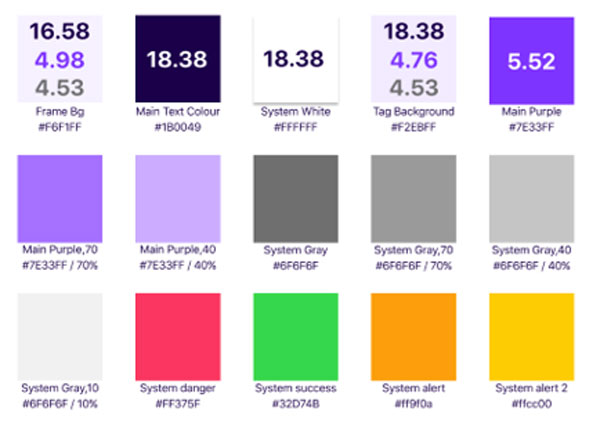
Choosing the right colours for this application was so challenging as the concept of the application is related to the users who act based on their emotions. It is clear that colours have different meanings and convey various emotions due to their psychological meanings. For the primary colour, we decided to go with a shade of purple as it is associated with overeating based on psychological articles. It is used for informational and practical services, so for an overeating app it would be ideal. Dark blue has been picked for the texts as it makes a sufficient contrast ratio. Other colours like red, green, etc., are used for the different states like a warning, success, etc.


Font family
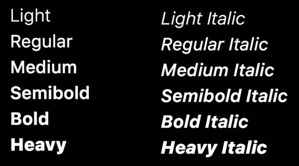
In collaboration with the development team, I decided to use Apple’s San Francisco font family, which is more compatible with iOS.
San Francisco has a variety of font-weight and styles, which allowed us to design the final design more user friendly and hierarchical. On the other hand, San Francisco is a sans-serif typeface that is the most suitable font family for developing an accessible application
Mood Icons
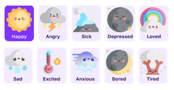
We were thinking of using emojis for the Mood tracker like other mood tracking applications in the initial sketches. After some sketches, I brought up the idea of using weather icons instead of emojis to make the application more personal and unique. In addition, users may encourage to use the mood tracker more consistent with a new concept. The other designers were satisfied with this idea, but we should listen to the users’ feedback about our proposed idea in the test sessions.

High-Fidelity Prototype

Dashboard
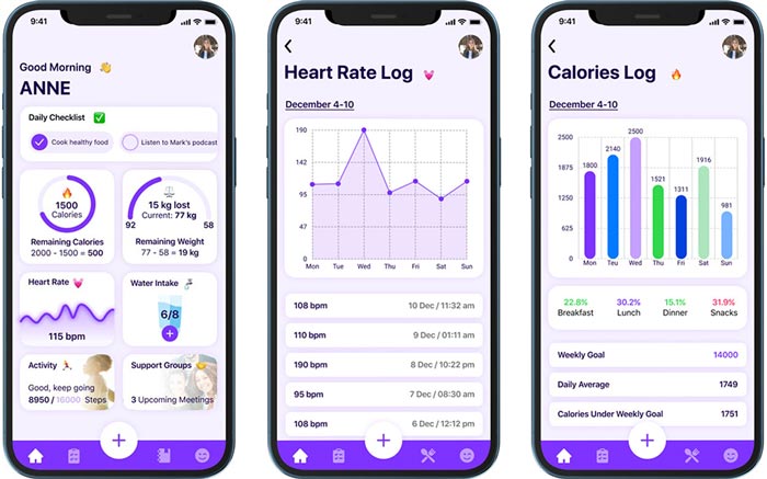
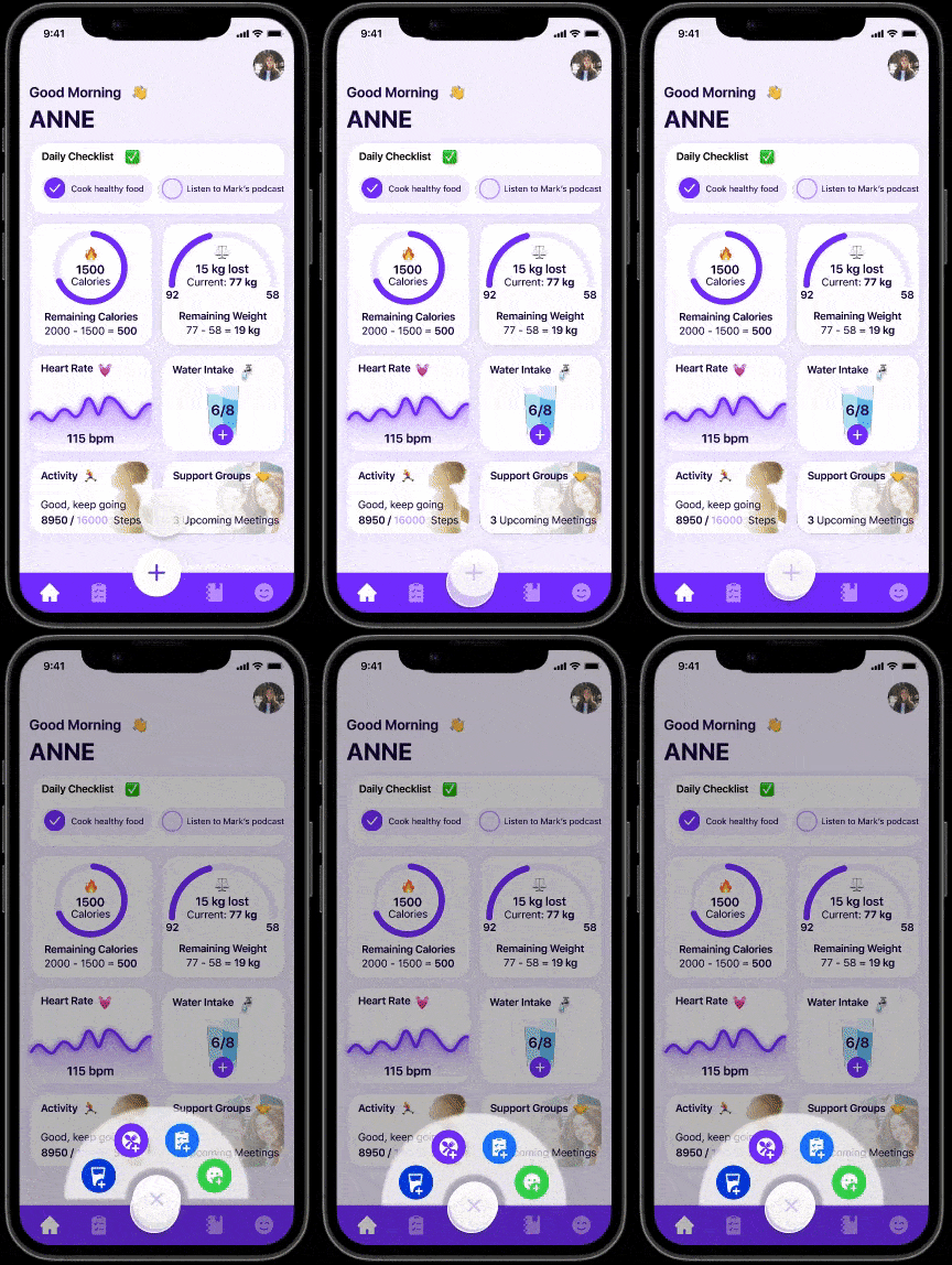
The most challenging page was the Dashboard in terms of design, as loads of numerical data should be visualised to convey the metric data to the users sufficiently and rationally. Users should access various shortcuts through the dashboard.
A greeting message was designed to convey the friendliness sense to the user as the first impression. The daily tasks summary section was designed as a horizontally scrollable area which allows users to view daily tasks and check the completed tasks. Two different circular progress bars were designed to visualise the remaining calories and the weight loss progress. The amount of drunken water is visible on the dashboard as well as external device data like heart rate and the number of steps. The support groups feature can be accessed through the designated area at the bottom of the page.
Popup Menu
Since the application work based on the user data, users should enter data such as their meals, tasks, moods and water intake several times a day. Reducing the number of clicks can reduce their barriers and improve the quality of their experience.
At the low-fidelity step, I drew an initial idea of a popup menu with several shortcuts. In the high-fidelity phase, I designed the popup shortcuts menu entirely interactive to get the users’ feedback during the usability test sessions. Users can add a new meal, water intake, task, and mood through these shortcuts with fewer clicks as well as their related menus.



Checklist
The checklist is designed to help people be more organised and reduce their daily barriers. I designed the main page of the checklist as multi-functional to see, prioritise and check the tasks. The top scrollable area allows users to select a specific date to see their defined tasks or even add a new task. Every single task is divided into a separate row with the ability to check as a completed task or drag and drop to assign a priority. The completed tasks are automatically crossed and go down after checking by the user. For adding a new task, users should click on the plus button on the navigation bar, enter the task title and assign a date. To reduce the user’s tasks in the future, I added a repetitive task toggle which allows the user to repeat a specific task multiple times regularly.
Food Diary
I designed the main page to show the users remaining calories and micronutrients through the top scrollable area. Every meal is divided into an accordion component with the micros data. Users can easily add their taken food by clicking the plus button and searching the expected food from the list or scan a food by scanning the barcode. After choosing the desired food, an overlay is designed to show the micros based on the portion size and quantity. In addition, users can select their mood before eating the item.


Mood Journal
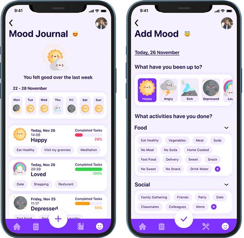
The Mood Journal is designed to help people find their emotional triggers by recording their emotional states and activities.
In designing the mood tracker, I decided to use weather icons instead of emojis to make the application more personal and unique and enjoyable for the users. On the main page of the mood journal, I designed a section to show the overall mood state of the users during the last week as well as each day separately. Every mood record can be visible with the details of time, activity and amount of completed tasks.
I designed a date picker at the top of the page on the add mood page. I designed the mood picker as a horizontally scrollable area. To select different activities related to the users’ moods, I categorised various activities into some groups based on an online open card sorting. Different activity groups are designed through the according components.
Profile & Add Device
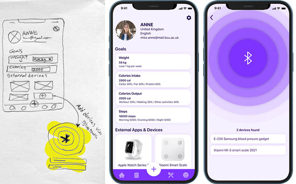
I designed the profile page with the ability to set new goals for the user and manage the users’ external devices. The added external devices are shown at the bottom of the profile page, and users can edit or delete them with a long tap on each device. New devices are easily added via Bluetooth, and users can easily interact with the designated device search.


Support Groups
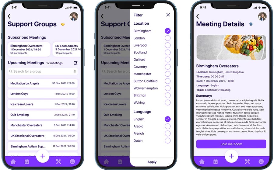
I designed the Support Group feature in a way that users can find the most relevant and suitable meetings based on their preferences. To obtain this matter, I developed a filter that allows users to narrow the results based on the location, language, time, etc. A list view is designed to show the most relevant results to the users as well as show the subscribed upcoming meetings at the top of the page through the horizontally scrollable area. The meeting’s detail page is designed to show the critical information of the meeting and a summary of the meeting’s purpose. Based on the development team’s decision, the meetings would be conducted by integration with the Zoom platform. I designed a button for the join meeting to navigate the user to the Zoom application.
Usability testing
We conducted two rounds of usability testing to determine possible usability issues. We used the mixed-methods methodology to collect both quantitative and qualitative data for both rounds. We took the unmoderated remote testing approach and think-aloud protocol. For each round of the usability test, we recruited 5 participants using the Maze platform. After each session, participants should complete a SUS questionnaire.
Goals and Objectives
- See how the users navigate around the checklist in the app.
- See how they respond to the colour scheme of the application.
- If the user is encouraged to use this app multiple times during the day.
- Do they find it easy to access the checklist?
- Can they access the nutrition page summary with ease?
- Does the layout of the support group appeal to the user?
- Would the user be able to monitor their eating habits throughout the day with ease?
- Does the user find it easy to add an external device and connect it to the app?
Tasks
- (Start from the welcome page) Go through the sign-up process.
- (Start from Checklist) Tick a task and go through adding another task to the checklist.
- (Start from Mood Tracker) Add their mood to the mood tracker.
- (Start from Dashboard) Find a support group, see the description and book a meeting slot.
- (Start from Diary) Add a meal or search for an ingredient and view nutrient levels.
- (Start from Profile) Add an external device and check the target weight.
- (Start from Dashboard) Access the dashboard to check their calories, macronutrient levels & water intake.
First Round
For the first round, 5 participants were selected by screener questions through the Maze, and on averagely, each session took around 15 minutes. At the beginning of the test, the scenario was described to the users and the tasks were provided to them after loading the expected flow of the prototype. After completing the test, a SUS questionnaire was provided to them via a google form.
Findings
The findings can be divided into four different categories.
- Quantitative findings based on the task completion time, SUS questionnaire results and error rate.
- Qualitative findings based on the think-aloud outcomes.
- Usability issues based on the observed users’ barriers in completing tasks from recorded screen videos.
Quantitative
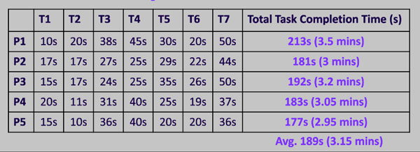

The result of calculated task completion times
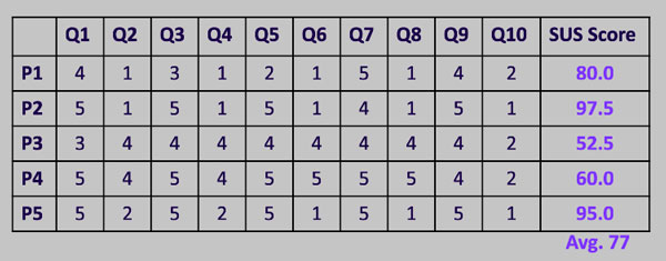

The result of the calculated SUS questionnaire
Qualitative
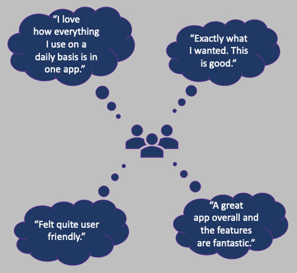

Insight Identification
Finding 1
The test results showed that the users could not easily interact with the Daily checklist in the dashboard due to the size of the checkbox.
Finding 2
The recorded videos from the users’ screens showed that users could not find the nutritional level section, and they needed help to find it.
Finding 3
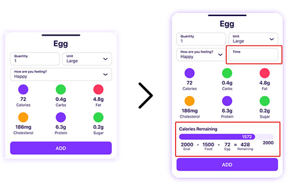
Some participants mentioned that they want to record their meal time, and they said they would like to see their remaining calories when they want to add a new food to the diary.
Finding 4
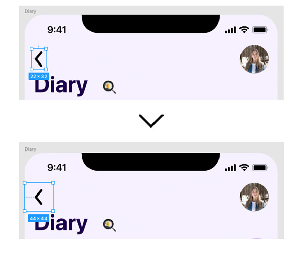
All the participants had difficulty interacting with the back buttons on the navbar. They should click multiple times to get back to the previous page.
Modification 1
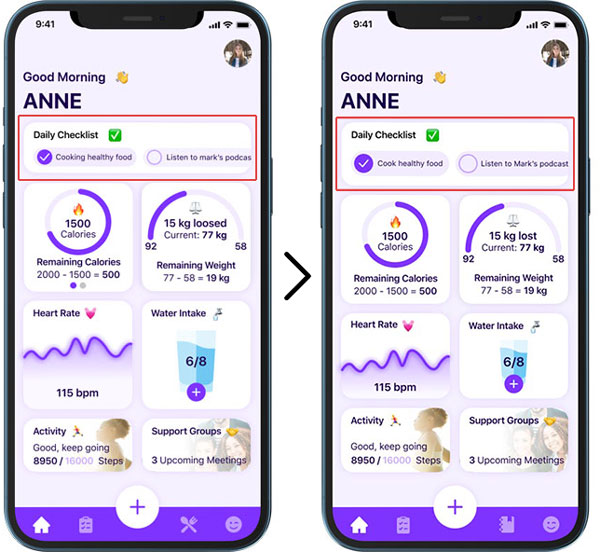
By viewing the screen recorder videos I realised that people had some difficulties checking the checkboxes in the daily checklist widget on the dashboard, especially when the participant is a man. Our hypothesis was the checkboxes are too small to tap with the finger.
To test the hypothesis in the second round of the usability test, I increased the size of the checkbox to help people tap the target area with more ease.
The second round of the usability test showed that the proposed solution impacted this feature’s usability as participants interacted with the daily checklist without any barriers.


Modification 2
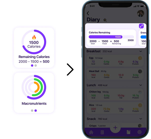
First, we designed the micronutrients merged with the remaining calorie widget on the dashboard, and users could swipe between the calorie counter and micronutrients. But after reviewing the videos of users’ screens, we realise that some users cannot find the micronutrient or cannot interact with the swipe gesture interaction.
We decided to change the micronutrient location from the dashboard to the food diary screen based on a brainstorming meeting. I used the idea of the horizontally scrollable component, which is used in most of the pages for different purposes, so I designed each micro as a progress bar at the top of the food diary page.
Modification 3
At the end of each test session, we asked the participants to share their comments or suggestions to improve the app’s usability. Some participants suggested that it would be helpful if they could record their meal time, and they mentioned that they would like to see their remaining calories when they want to add a new food to the diary as well.
I refined the add meal overlay and added the time picker next to the feeling input. At the bottom of the overlay, I also put the calories reminder.


Modification 4
The most challenging issue that all the participants had difficulty with that was the back buttons on the navbar. When they wanted to get back to the previous page, they tapped the back button on the navbar multiple time, but no action occurred. After reviewing the prototype, I realized that the clickable area was too small, and users tapped out of the area.
I changed the clickable area size in the nav bar from 23 by 32 px to 44 by 44 px based on the WCAG 2.5.5: Target size. In the second round, participants could easily click on the back button.
Second Round
After implementing the changes of the first round of usability, again, 5 participants were recruited from the age of 21 to 48. The same tasks and procedures were applied as well in the first round. After completing the test, a SUS questionnaire was provided to the participants.
The main aim of the second round was to collect quantitative data to compare with the first round.
Findings
The second round of SUS questionnaire results showed an improvement of 3.5 points.
The calculated task completion time revealed an improvement of 41.6 seconds on averagely.
SUS Questionnaire
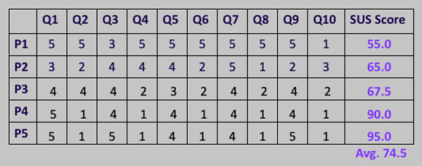

The result of the second SUS questionnaire
Task Completion Time
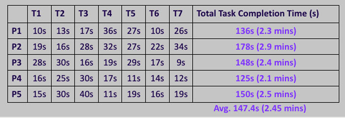

The calculated task completion time
Results and takeaways
Working with two UX design apprentices was a joyful experience for me to review my previous taught and transfer the updated UX methods and trends to them.
Implementing various features in one application was a good opportunity for me to show my strengths and learn new things. This project was completely different from my previous projects as the users act with their emotions, and it impacts their experience in using the application.
Some key takeaways from this project are:
- User testing doesn’t end after development. Design is an iterating process to improve the experience for the end-user. Designers should always find ways to collect and listen to the user’s feedback.
- Involve in the development process. Knowing the limitations and barriers upfront will help designers make more informed design decisions, thus reducing the amount of rework later on.
- Big challenges require small steps. Taking small steps is the best strategy because significant changes can not be brought over overnight. Consequently, develop more realistically applicable and strategically meaningful tools that will lead in the intended direction.
