Case Study
Inclusive Design of a Smart Home Application


My Role
Target User
Tools
Client
Project Overview
This project is related to a smart home web application that focuses on web and mobile accessibility for people with cognitive, visual, auditory and physical impairments. Its goal is to facilitate the use of other abilities of impaired people to control their home appliances more efficiently, reducing the daily barriers associated with them. Accessibility of features and elements was the primary concern in the design of this web application.
MY CONTRIBUTION
I made a 3-month contract for this project as a User Experience Designer to research, design, test and deliver the product.
My primary task was to understand the barriers and limitations of the target users by studying disability literature and approaching the users to provide appropriate design decisions and design an interactive prototype based on the company’s and users’ requests. In addition, I was responsible for evaluating the proposed design with the target users to make sure that the solution was accessible and usable for people with different impairments before the development stage.
Process
Since this project was focused on accessibility and users’ disabilities, much research was needed to analyse different impairments and get familiar with their barriers, needs and goals. On the other hand, the solutions should be visualised through a rational design to make the ideas and concepts measurable and implementable. The solutions should be evaluated to find the usability issues of the proposed solutions. In the end, based on the test results, the final design should be implemented.
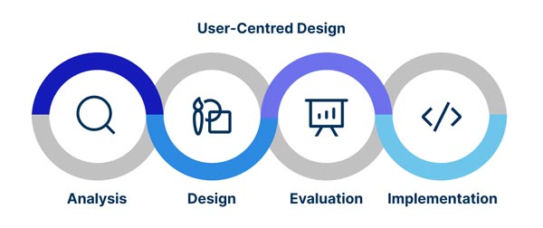
In order to apply all of the mentioned steps, the User-Centred Design approach has been taken to focus on the users and follow the steps of Analysis, Design, Evaluation and Implementation.

Analysis
I started with the disability study to better understand different impairments and their barriers and needs. It was an essential step to propose a user-based application for disabled people. The study focused on four main types of impairments based on medical articles namely visual, auditory, cognitive and physical.
Disability Analysis
In today’s world, as more public services are delivered online, those without access to these technologies are more at risk of becoming even more excluded. A wealth of information is available on the world wide web, but it will not be accessible unless designed to be compatible with assistive technologies. Web accessibility is not just a high-level theoretical goal; many guidelines and tools are available to help web developers and designers make their websites and applications more accessible. In addition, as this topic impacts social equality, many governments make accessibility a requirement for websites. Based on the social model of disability, people are impaired by societal barriers, not by their impairment. Medical models can focus on fixing an impairment, but social models focus on societal change, self-advocacy, and peer support, which can promote the adoption of assistive technologies. Designers of assistive technologies may find the medical and social model of disability helpful in improving the equality of impaired people’s lives. A person can make their impairment less visible and sensible by using assistive technology. Assistive and digital technologies can help people with impairments achieve a good quality of life by making everyday activities more efficient through hiring technological solutions like IoT in their lives, which can be applied in many areas. As an example, Infrared switching, Bluetooth and wireless systems have revolutionised device control in the home and enabled users to abandon hard-wired systems. Nowadays, due to the miniaturisation of electronic components and the falling cost of wireless communication products, these kinds of technologies are more affordable.
In contrast, Impaired people are less likely to access digital technologies due to unrealistic expectations, lack of confidence in using technology, unawareness of limitations, insufficient needs assessment, inappropriate device selection, caregiver disengagement, and the tools’ cost. In advance, most insurance companies do not undertake the assistive technologies costs.
User Research
I had set a couple of aims in mind before conducting user research.
- To understand the reasons why people use a smart home application.
- To identify which barriers they have in interacting with computers and mobile phones.
- To recognise their daily obstacles and frustrations.
- To understand their limitation due to their disabilities.
I designed a survey with a few questions about their demographical information, disabilities, limitations, frustrations, needs and goals.
I used SurveyMonkey to find my specific target audience and totally, eight people answered the survey. Three of them were men with different impairments, including Dementia, Deafness, and Blurred vision. Five of them were women with Autism, Epilepsy, Multiple sclerosis and Parkinson’s disease impairments.
Personas
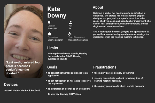
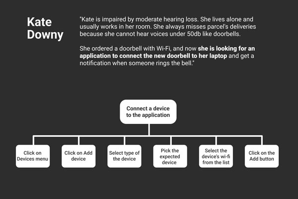
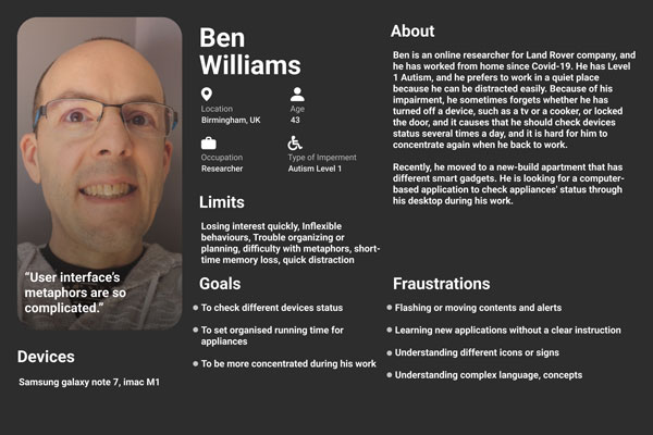
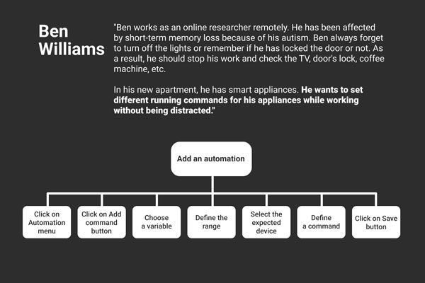
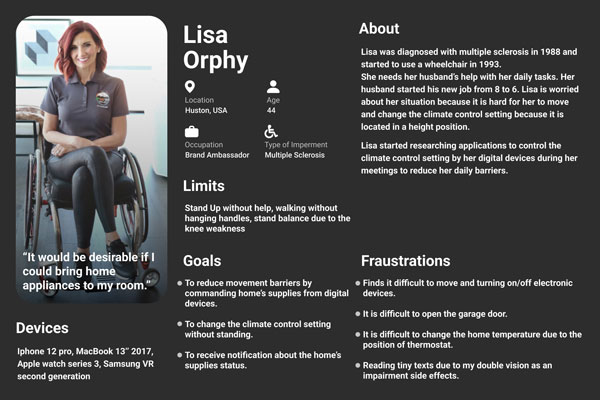
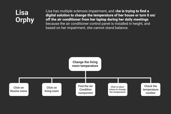
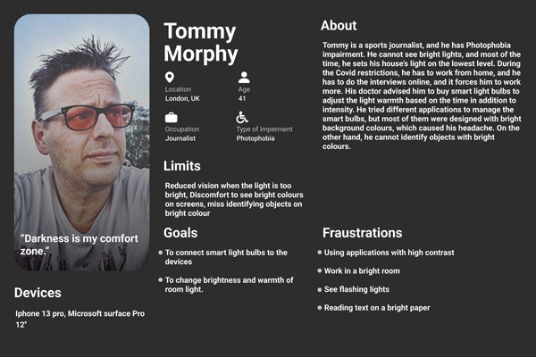
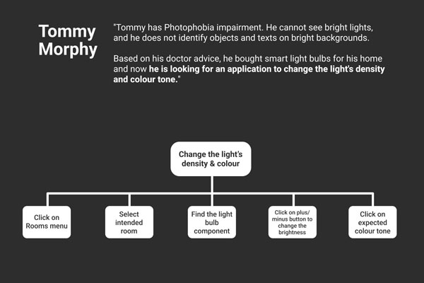
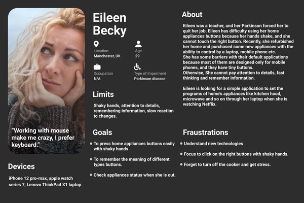
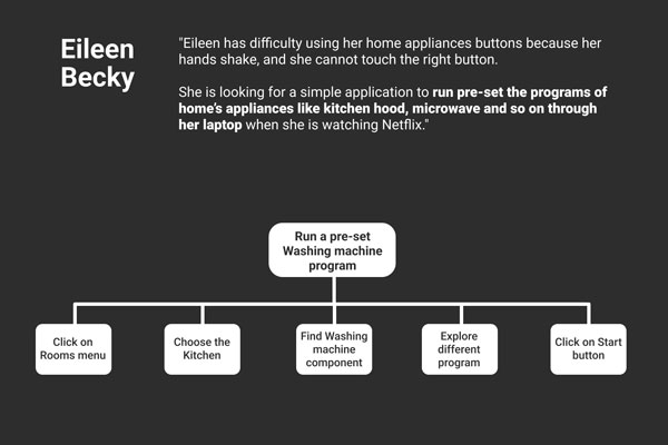
Five personas are developed to identify users’ impairments, limitations, behaviours, goals, needs and frustrations based on user research and disability studies. The identified impairments are Multiple sclerosis, Parkinson’s disease, Moderate hearing loss, Photophobia and Autism level 1. Furthermore, five scenarios and HTA diagrams are developed to address the solutions based on users’ needs.










Problem Statement
In today’s world, as more public services are delivered online, those without access to these technologies are more at risk of becoming even more excluded, further decreasing their chances of a successful life, and there is an obvious fact that people with different impairments want advanced technology to increase their independence in their lives. Assistive technologies can play a role in augmenting human abilities, using other abilities, hiding disabilities and revealing them to others, and their impact on the experience of disability. Websites and applications should be designed in a way that people with various disabilities can use them with ease.
DESIGN CHALLENGES
Designing an application for people with impairments is generally challenging, especially when you want to design for a diversity of impairments. The most challenging part of the inclusive design is the barriers to studying and researching impaired people, as there are many ethical procedures to get connected with the target users. Due to the social model of the disability, disabled people usually are not confident and encouraged to participate in research and test sessions.
The other significant challenge is most of the guidelines and standards are designed for inclusive development. The lack of enough UX guidelines regarding accessibility and inclusive design is substantial.
Design
In designing the Comfort web application, I mainly followed Web Content Accessibility Guidelines (WCAG) 2.1. The features had defined by the product owner, and they needed to be designed in a sufficient way that can be interactable by impaired users. I was responsible for making the major design decisions with logical and supportive documents.
In the following, we will walk through the considered inclusive design decisions and initial thoughts, low-fidelity and high-fidelity prototypes.
Inclusive Design for Physical Impairments
Typically, people with physical impairments have difficulty controlling their muscles because of weakness and limitations and navigating the user interfaces is not a task that can be accomplished quickly. Individuals commonly use keyboards to interact with computers. Typically, interaction with a mouse is problematic for the physically impaired due to the fine movements required. So, based on WCAG 2.1.1 (Level A) guideline, the application should be fully accessible using a keyboard, and the elements should be designed to be focusable using the keyboard’s “Tab” key. Furthermore, to make pointer input areas more accessible for the users who are physically impaired and want to interact through the mouse, based on the WCAG 2.5.5 (Level AAA) guideline, the size of the target for pointer inputs should be designed with sufficient size.
Inclusive Design for Visual Impairments
People with visual impairment use different solutions to explore a website based on the type of their visual problem. A variety of technical barriers exist in designing an accessible product, such as the lack of text alternatives, the use of invalid HTML, and the wrong colour contrast. Many visually impaired use screen readers and different solutions are considered to design the application compatible with screen readers. Based on the WCAG 1.1.1, non-text content should come with a text alternative except decorative non-text content. For example, the icons should be implemented with a blank “alt” attribute to be ignored by assistive technology. To help people realise the purpose of the page by the screen readers, a descriptive title is considered to be scanned by screen readers, as suggested on WCAG 2.4.2. In addition, It should be considered to use limited colour to prevent frustration for the visually impaired. The colours used in the proposed application are selected dark blue and red, known as a colour-blind-friendly palette. All of the visual presentations should have a contrast ratio of at least 4.5:1 for texts smaller than 18 points and a contrast ratio of at least 3:1 for text bigger than 18 points based on WCAG 1.4.3 to make a sufficient contrast for people with a low vision. Based on the visually impaired persona who has photophobia, a feature should be considered to change the application’s colour mode to the dark mode. Another feature is considered called hover zoom which displays a large text of items under the pointer to help people with low vision. In addition, based on the WCAG 1.4.4 text should be resized without assistive technology up to 200 percent. For the typography, based on the research, there is some evidence that sans-serif fonts are more legible for the visually impaired (Papadopoulos, 2005). So, the Calibri typeface is chosen, which is supported by most of the browsers.
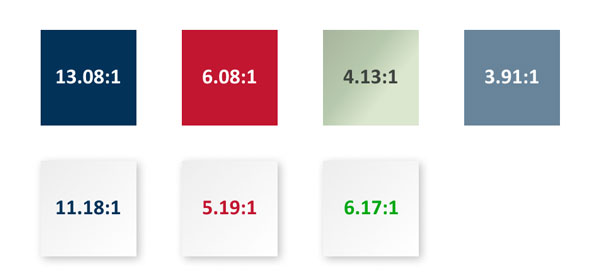

Selected Colour Pallete and contrast ratio combinations
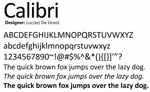

The selected font-family
Inclusive Design for Auditory Impairments
The community of deaf or hard of hearing people has developed different communication strategies that mainly depend on visual abilities. Based on this application’s concept, people use it to control and be aware of their home appliances. Based on the persona, she has various problems with home devices that make a sound like a doorbell because she cannot hear the ambient sounds. The main design decision was to visualise sound signals. A notification popup is considered to help people with auditory impairment be aware of the status of their home’s appliances by getting a visual notification on their system when a sound signal occurs. In addition, to make sure people do not miss any notification, a feature called accessible notification is considered to flash the screen one time when a sound notification occurs.
Inclusive Design for Cognitive Impairments
Cognitive impairment is characterized by impairment in cognitive function or learning ability. The autistic persona has difficulty understanding the metaphors. On the other hand, learning new concepts or computer language is frustrating. So, the user interface should be very clear, straightforward and familiar for the user. Based on the research, people with learning disorders have a better user experience with skeuomorphism (Shahid, 2016). To design a proper user interface, the skeuomorphism design style is used in this application, which simulates the look and feel of a real-world object. People with cognitive impairments need more instructions to do a task. For example, the WCAG guideline 3.3.3 is considered in the sign-up process to provide a text description to identify requirements errors. Based on the persona, people with autism lose their focus quickly and have unexpected reactions to sounds, movements, and sights so four different WCAG guidelines are considered. First, to pass guideline 2.3.3, motion animation triggered by interactions can be disabled through the accessibility menu. Second, to follow guideline 2.3.2, the accessible notification defined in the auditory impairment section is flashing only once. Third, the user must be able to pause the background auto-play videos based on WCAG 2.2.2. Based on the WCAG 2.4.8, the user’s location should be determined by a breadcrumb trail to make sure that users are aware of their location in the application.
Low-fidelity prototype
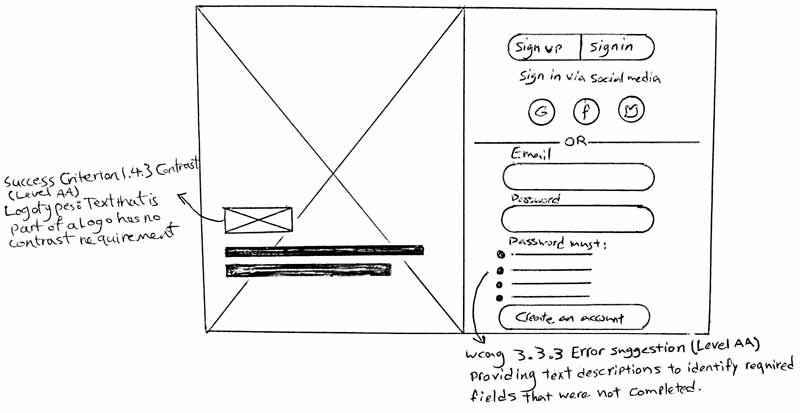

Sketch of user sign-in, and sign-up page with consideration of WCAG 3.3.3 error suggestion
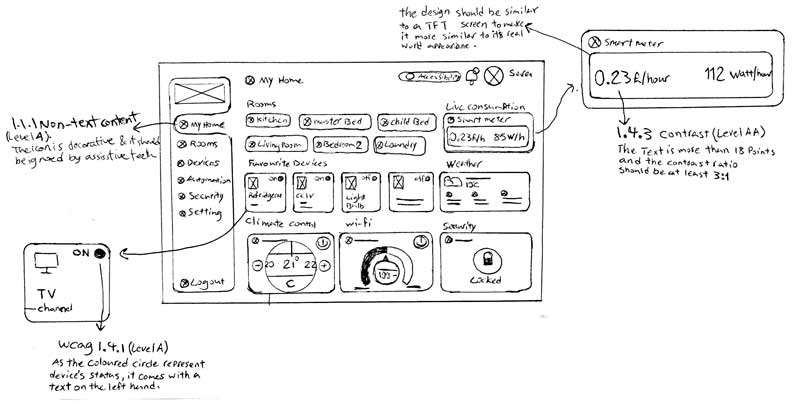

Initial sketch of dashboard view with consideration of decorative contents (WCAG 1.1.1) and contrast (WCAG 1.4.3)
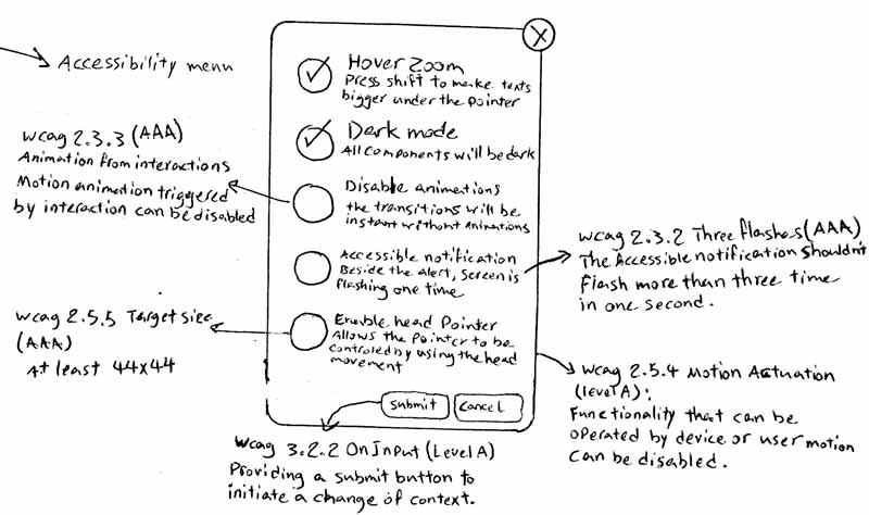

Rapid paper prototype of accessibility options with consideration of animation triggers (WCAG 2.3.3), check box target size (WCAG 2.5.5) and flashing contents (WCAG 2.3.2)
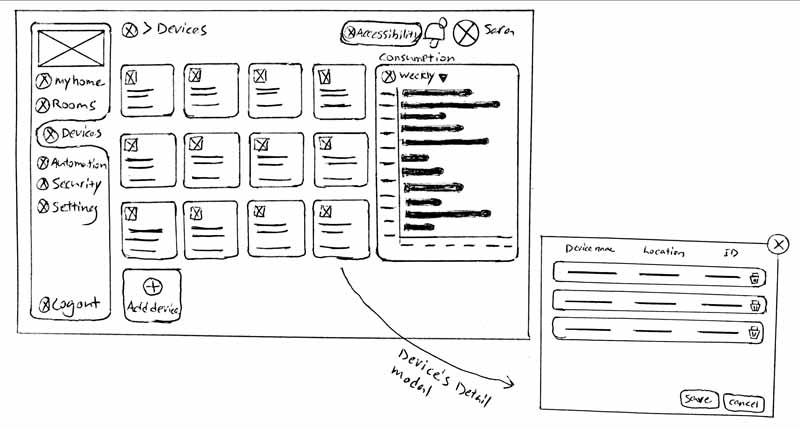

Sketch of devices list view and devices details modal
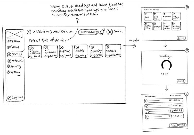

Sketches of add device view and its modals, consideration of descriptive labels based on WCAG 2.4.6
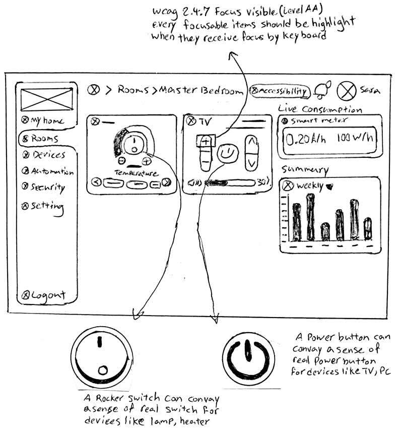

Initial thoughts of skeuomorphic buttons and switches, consideration of keyboard focus visibility
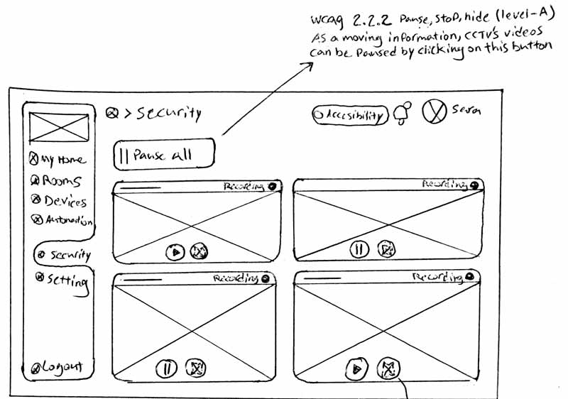

Rectified sketches of CCTV list and full-width view with consideration of ability to pause auto-play background videos
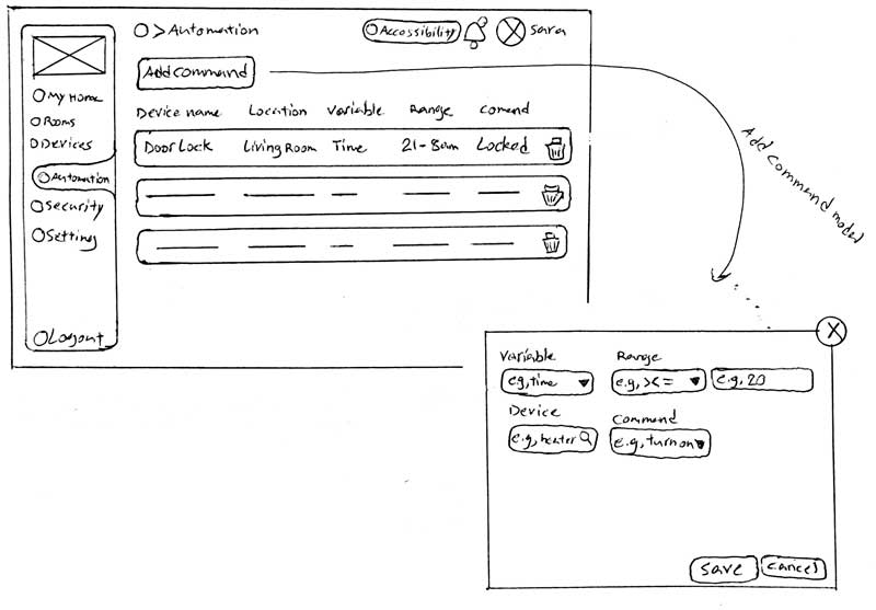

The initial thought of automation list view and add’s modal
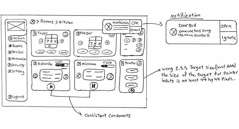

Rapid prototyping of system notifications and consideration of components consistency and buttons’ target size
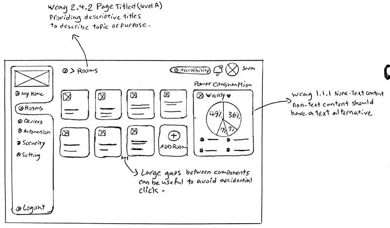

Sketch of rooms overview with consideration of large gaps grid, providing descriptive titles (WCAG 2.4.2) and text alternative for non-text contents (WCAG 1.1.1)
High-fidelity prototype
After iterating the low-fidelity stage and modifying sketches, I started designing the final screens in Figma. Developing the Hi-Fidelity prototypes was necessary for this project as there is no ready-made UI library for developing the Skeuomorphism metaphor. I started to build different elements based on the designated sketches with the Skeuomorphism concept. I tried to design the elements similar to their real-world look and feel. In designing the high-fidelity prototype, I considered the interaction design in-depth, and I created different animations for the interactions to make them as similar as possible to their real-world movement.
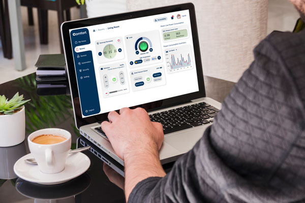


Some examples of designated Skuemorphism UI
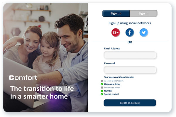

Sign-up
Users can navigate to the application through the sign-up and sign-in process. Based on the WCAG 3.3.3: Error Suggestion, I designed the password hint section to help people set a password in a correct format with the suggestions as well as to detect applicable errors in choosing the password.
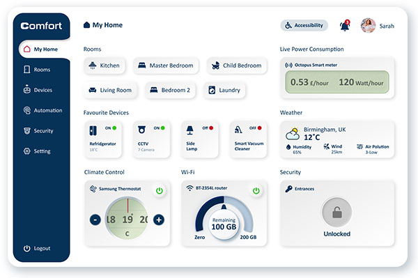
Dashboard
The main page of the web application is the dashboard which provides a summary of different rooms, favourite devices, live power consumption and weather condition. Also, the climate, security and Wi-Fi controllers are provided.
In terms of layout, the screen is divided into different sections. The sidebar is designed as a static section that shows the application’s logo and different menus. The navigation bar is also considered a static section containing the page title, accessibility menu, notifications, and profile picture. Elements are considered with ample dimensions and plenty of gaps to avoid accidental clicks or being ignored.

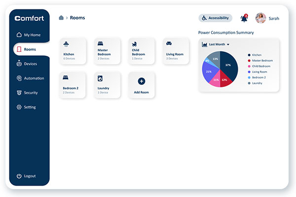

Rooms
The Rooms menu offers access to the different rooms via a grid base menu with big items and plenty of white spaces. Each of the rooms can contain different devices, which can be adjusted by the user. Also, people can add, delete or edit a room.
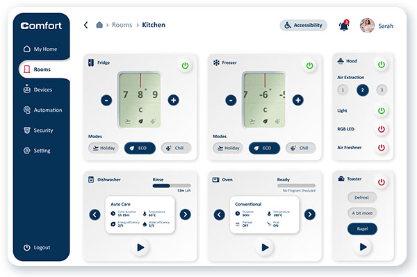
Room Details
Different rooms include various appliances and devices, which the user can control. Programable devices are designed with various pre-defined programs to eliminate users’ barriers to programing the appliances manually.

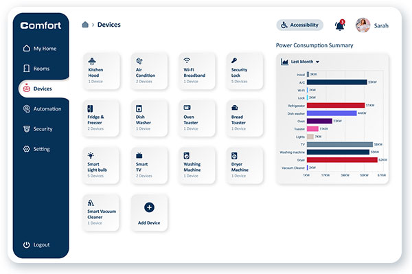

Final design of the Device list view
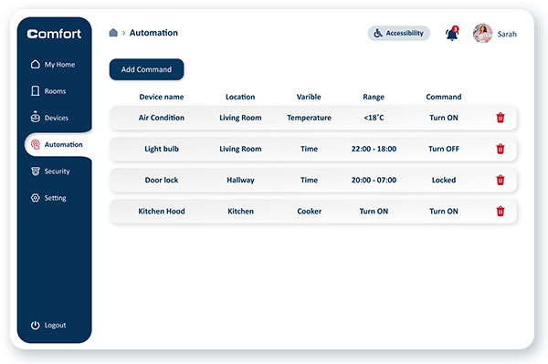

Proposed design for the Automation feature
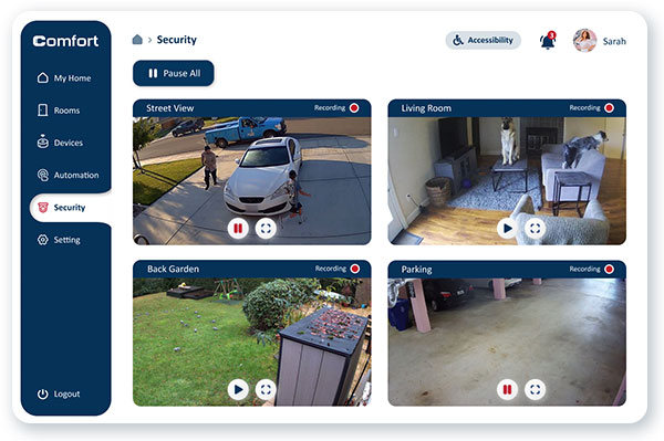

Security
The security menu can show CCTV devices’ live and recorded videos. To improve the accessibility of this feature for people with cognitive impairment, I designed a pause button at the top of the page, which allows users to pause all of the auto-play background videos to follow WCAG 2.2.2: pause, stop, hide.
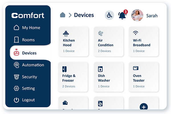

An example of a 200% browser zoom layout without any assistive technologies based on WCAG 1.4.4: Resize Text
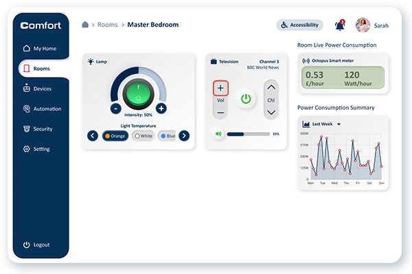

An example of active keyboard focus (red square), controlled by the tab key, WCAG 2.4.7: Focus visible
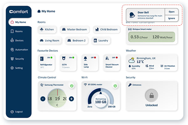

A view of popup notification to visualise sounds' notification for people with auditory disability
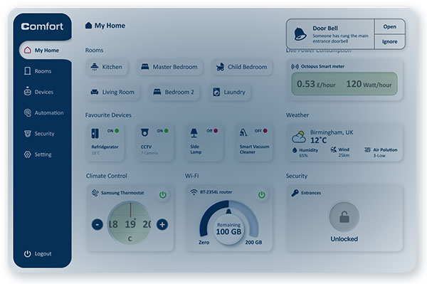

Accessible notification view, the screen is flashing when a sound notification occurs but only once to avoid seizures based on WCAG 2.3.2 Three Flashes.
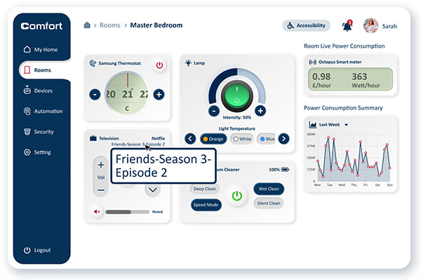

A view of Hover Zoom feature which displays a large text of items under the pointer's hover
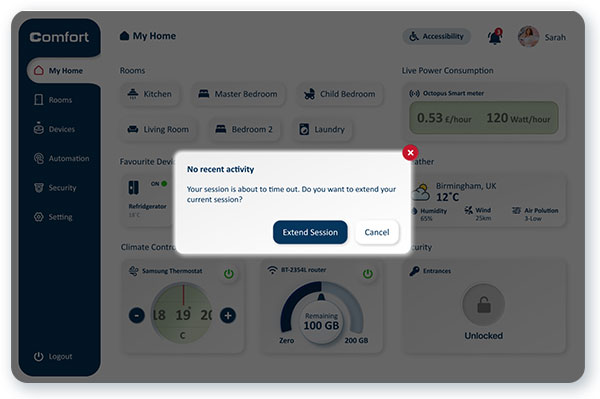

Designated session time out to warn users of the duration of any inactivity with the ability to extend the session based on the WCAG 2.2.6: Timeouts
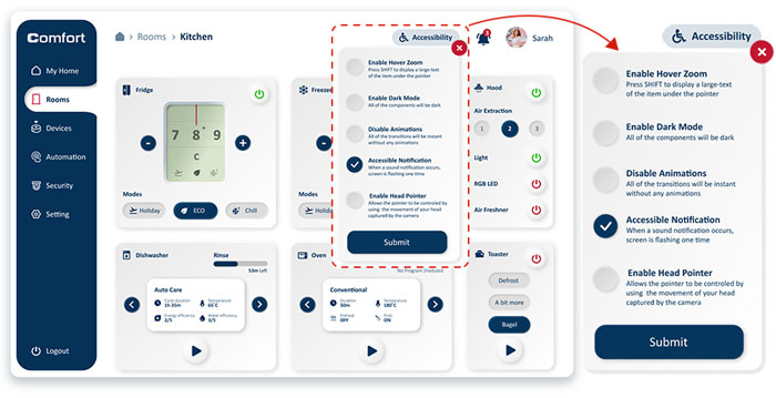

Accessibility Menu
The accessibility menu is designed to allow users to control the application’s user interface with the features of enabling/disabling Hover Zoom, Animations, Accessible notification, Head Pointer and Switching the Colour mode to light or dark mode.


Some examples of following WCAG 2.5.5: target size
![[21151fh644]-CMP7219---Accessibliity-and-AT-Coursework-Report-(4)-30 https://abbasabadi.co.uk/wp-content/uploads/2022/06/21151fh644-CMP7219-Accessibliity-and-AT-Coursework-Report-4-30.jpg](https://abbasabadi.co.uk/wp-content/uploads/2022/06/21151fh644-CMP7219-Accessibliity-and-AT-Coursework-Report-4-30.jpg)
![[21151fh644]-CMP7219---Accessibliity-and-AT-Coursework-Report-(4)-30 https://abbasabadi.co.uk/wp-content/uploads/2022/06/21151fh644-CMP7219-Accessibliity-and-AT-Coursework-Report-4-30.jpg](https://abbasabadi.co.uk/wp-content/uploads/2022/06/21151fh644-CMP7219-Accessibliity-and-AT-Coursework-Report-4-30.jpg)
An example of a breadcrumb on the navigation bar based on WCAG 2.4.8: Location
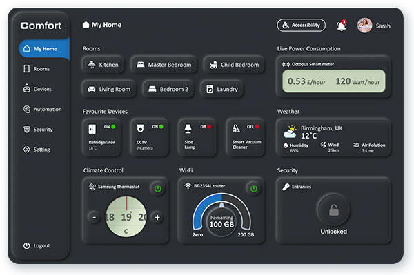

Dark Mode User Interface
Based on the visually impaired persona who has photophobia and is very sensitive to bright colours, on the Accessibility menu, a feature is designed to change the web application’s colour mode to the dark mode. Although the colour mode is dependent on the operating system, it can only change the application’s colour mode and cannot control the website’s/web application’s colour mode.
Multi-platform Accessibility
The term “mobile” refers to a broad spectrum of wireless devices. A wide range of mobile devices (feature phones, smartphones, tablets) are available today. It also includes “wearables” such as smart glasses, smartwatches, fitness bands, and other small computing devices embedded in aeroplane seatbacks, car dashboards, and household appliances.
On a mobile device, many interactive elements can be shown on a small screen due to the high screen resolution. Nevertheless, these elements must be big enough and separated from each other enough to be safely targetable by touch.
Gesture-based Interaction
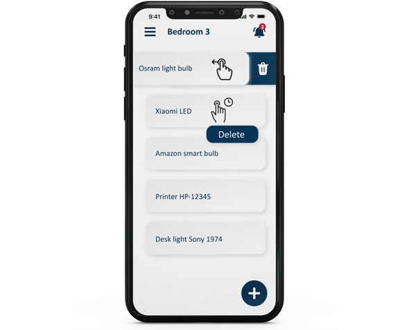
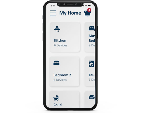
Mobile devices are often operated by making gestures with a touchscreen. It can be as simple as tapping one’s finger or as complex as drawing shapes with multiple fingers and tapping multiple times. Based on the Mobile WCAG 3.3: Touchscreen Gestures, the gesture-based interactions should be operable in an alternative way.
The picture shows the compatibility of an example action with the swipe left system-defined gesture and provides an alternative way (tap and hold) to perform a gesture-based action


Pinch Zoom
Mobile devices with small screens allow users to adjust the size of content using a variety of methods. The most common method is pinch-zooming which enables users to zoom on a specific part of the screen with a two-finger pinch interaction. To obtain mobile WCAG 2.2 zoom/magnification, an example of a 200% pinch-zoom is designed for development purposes.
Screen Orientation (Portrait/Landscape)
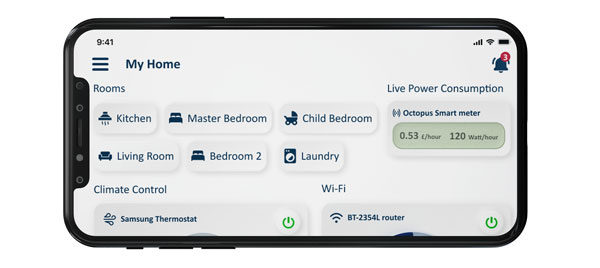
Depending on the app, the screen may be set to a particular orientation (landscape or portrait), and the user will need to rotate the smartphone accordingly. However, the mobile devices of some users have been set up in a fixed orientation (e.g. on the wheelchair).
In the process of designing the proposed web application, based on the mobile WCAG 3.1 guideline, different orientation is considered for mobile phone.

Evaluation
The evaluation is conducted with five participants to test the usability of the proposed web application prototype and find the deficiencies in the user interface and gather users’ comments and suggestions.
Participants
Five participants were present for the evaluation, ranging in age from 22 to 36. Four of them were female, one was male, and they all had a variety of occupations, including student, customer service advisor, sales manager, hospitality staff, and housewife.
In terms of disability, the participants were selected with various impairments, including Autism, Parkinson’s disease, Low vision and Epilepsy.
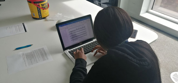

A scene of the usability sessions
Methodology
The moderated in-person usability testing method is chosen for the evaluation, involving five participants observing the moderator. The sessions are conducted in the same situation, such as a MacBook Pro 13 inches laptop, a chair with handles and the same lighting condition. The sessions were recorded for future studies. Before the test, the consent form is provided to the participants, and some demographic information is collected like their ages, genders, disabilities and occupations. Before the test, the application’s concept and personas are expressed to the participant by the evaluator to make them aware of different impairments that should be considered during the test. A Mixed-Methods approach has been taken for the data gathering, including quantitative data result from task completion time and the SUS questionnaire, and qualitative data result from the think-aloud protocol and open-ended questions.
Tasks
Eight different tasks, which are shown below, are provided by the moderator to complete by the participants:
- Change the living Room temperature to 18C from the rooms menu.
- Run the breakfast program for the dishwasher.
- Add Samsung smart dryer to the devices.
- Find the street CCTV view and make it fullscreen.
- Turn on the child’s bedroom light and change the colour of the light to yellow.
- Define a new automation program command.
- Disable web application animations.
- Set the fridge and freezer on holiday mode.
During the test, all of the triggers and participants’ thoughts are written by the moderator to use as the qualitative data for future developments. Each task’s completion time is calculated for the result of quantitative data.
At the end of the test, participants were asked to provide their suggestions, questions and comments about their experience with the proposed web application. For the final step of the test, a SUS questionnaire form is provided to the participants to collect more quantitative data.
Findings
The quantitative data based on the task completion times shows an average of 186.45 seconds for all eight tasks, with a minimum and maximum of 137 and 265 seconds. As a result of the SUS questionnaire, the total average score is 86.5. Four of the total results show 87.5, and one of them is 82.5.
The qualitative data is gathered as well by writing the participants’ thoughts, suggestions and comments.
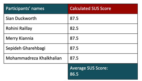

The Results of the SUS Questionnaire
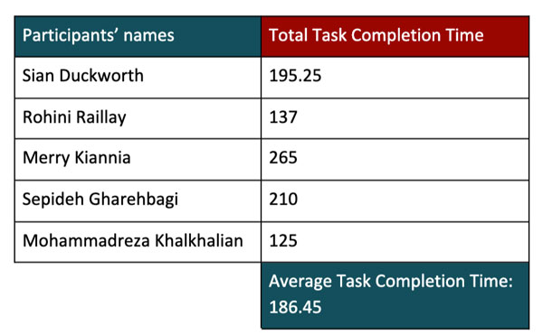

The Results of the Task Completion Time
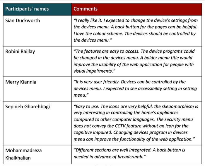

Participants feedback
Finding 1
The participants mentioned that a back button for the pages could be helpful for providing better navigation.
Finding 2
One of the participants suggested that a bolder menu title would improve the usability of the web application for people with visual impairments.
Finding 3
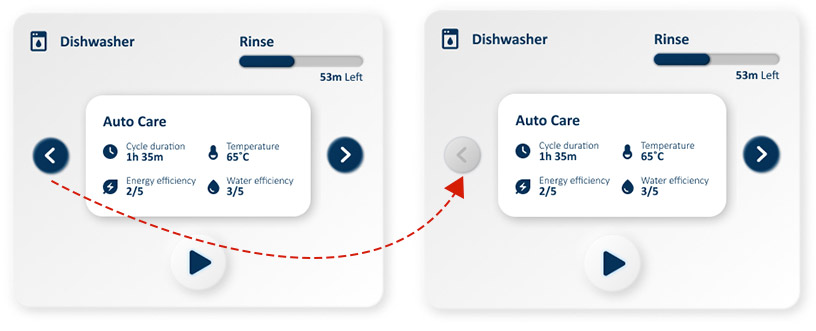
Based on the observation, one of the participants had some difficulties in changing dishwasher programs due to the lack of a disabled state button.
Finding 4
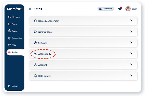
The autistic participant had some difficulties in finding the accessibility menu. She expected to find accessibility features in the setting menu.
Finding 5
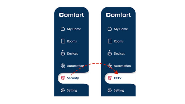
The autistic participant also suggested that changing the security menu title to CCTV would help improve the understandability of language for the cognitive impaired.
Finding 6
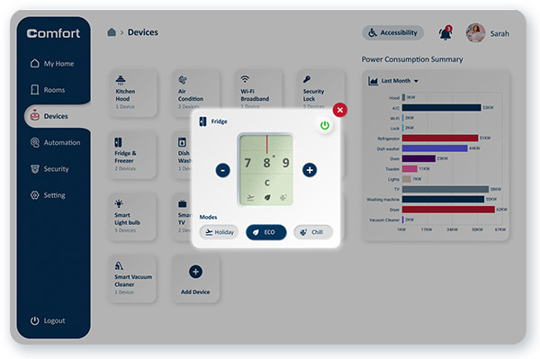
Based on the observation and participants’ thoughts, four of them expected to find the devices’ settings on the devices menu as well as the rooms.
Modification 1
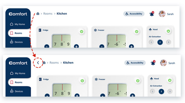
Two participants mentioned that getting back to the previous steps is frustrating. They suggested a Back button would help them navigate the application with more ease.
I modified the prototype and designed a back button in the navigation bar before the breadcrumb. In this way, people can get back by clicking on the back button and breadcrumb’s titles.


Modification 2
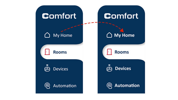
The participant with a visual disability who had low vision experienced difficulties with the interacting menu. The think-aloud protocol revealed that the user had a problem reading menu titles, and she suggested a bolder text could make the text more readable.
In response, I changed the font-weight of the menu title from 300 to 600.
Modification 3
The autistic participant had difficulties performing task number 4, which asked users to find the CCTV view in the application. At the end of the test, the participant mentioned that he expected to see the title CCTV instead of Security through the open-ended interview.
I change the title of the Security page to the CCTV to make the title more comprehensive for people with cognitive disabilities.


Modification 4
The participant with the cognitive impairment could not find the Accessibility menu on the navbar and based on his recorded thoughts. He expected to see the Accessibility options in the Setting menu.
I kept the Accessibility button at the navbar as well as designed a new setting item in the Setting menu with the name Accessibility with the same functions.
Modification 5
Based on the observation and participants’ thoughts, four of them tried to change the appliances’ configuration from the devices menu instead of the rooms.
I had assumed that people navigate through the rooms to find the expected appliance, but they performed differently.
I changed the user flow and added a way to access the appliances’ configuration through the devices menu. I designed a modal for the device page to show the appliances’ components as a modal by clicking on each of them.


Modification 6
One of the participants with a cognitive disability got stocked in task 2, which asked users to run a specific program for the dishwasher. By reviewing the recorded video from the screen and listening to the user’s thoughts, I realised that due to the lack of a disabled state for the arrow keys, the user expected to change the program by clicking the wrong button.
I modified the arrow key component and designed a new state for the disabled arrow key to accomplishing this problem.
Results and takeaways
The feedback I received from the usability study and the high-fidelity prototype has been positive. They show that the design of this app and website is usable and meets the user’s needs.
A quote from the target user feedback:
“Awesome work! This would eliminate my daily barriers in an effective way.”
Some key takeaways from this project are:
- Ethical process of inclusive design: Before this project, I thought the process of designing, user interviews and usability tests for the impaired people was the same as others, but now I learned how should I deal with disabled people, what should I ask, and what consideration should be taken when I am working with impaired people.
- The importance of literature study: I learned that in designing an accessible website or application, the designer should abandon the biases and solutions in their mind. All of the design decisions should rely on an experimented assumption.
- The impact of design guidelines: After testing the prototype with the real users, I was surprised when I saw a limited number of usability and accessibility issues. I realised that applying the Web Content Accessibility Guidelines helped me to deliver an accessible and usable product based on the best practices. Implementing the accessibility design guidelines to a product might be time-consuming but, it significantly reduces the future iteration and users’ barriers.
- Limited chance to find the right people: In the process of designing this web application, I understand that you might have a single chance to interview or conduct the usability test with the expected user as there are some limitations in accessing impaired people for our interview or test sessions like the cost of transportation, the frustrating process of user research for impaired people and etc.