Case Study
Designing an Enterprise CMMS/EAM SaaS

My Role
Target User
Tools
Client
Project Overview
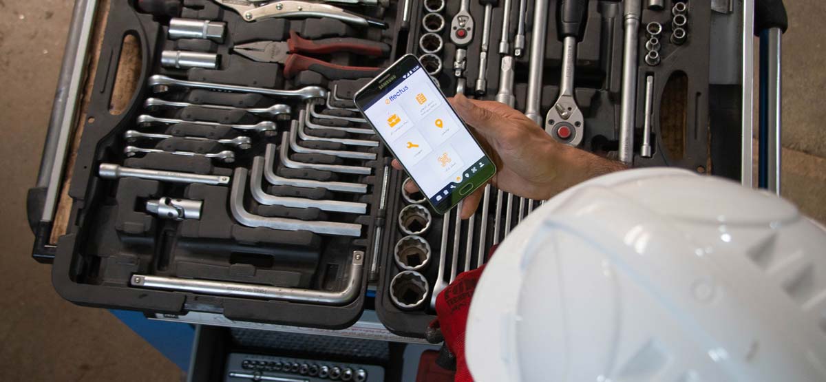
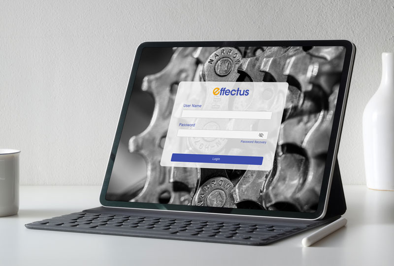
This project is related to the Effectus EAM (Enterprise Asset Management), CMMS (Computerised Maintenance Management System) and APM (Asset Performance Management) web application. This application is used by big industrial companies to manage their physical assets and improve their performances.

MY CONTRIBUTION
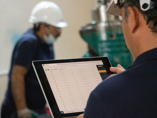
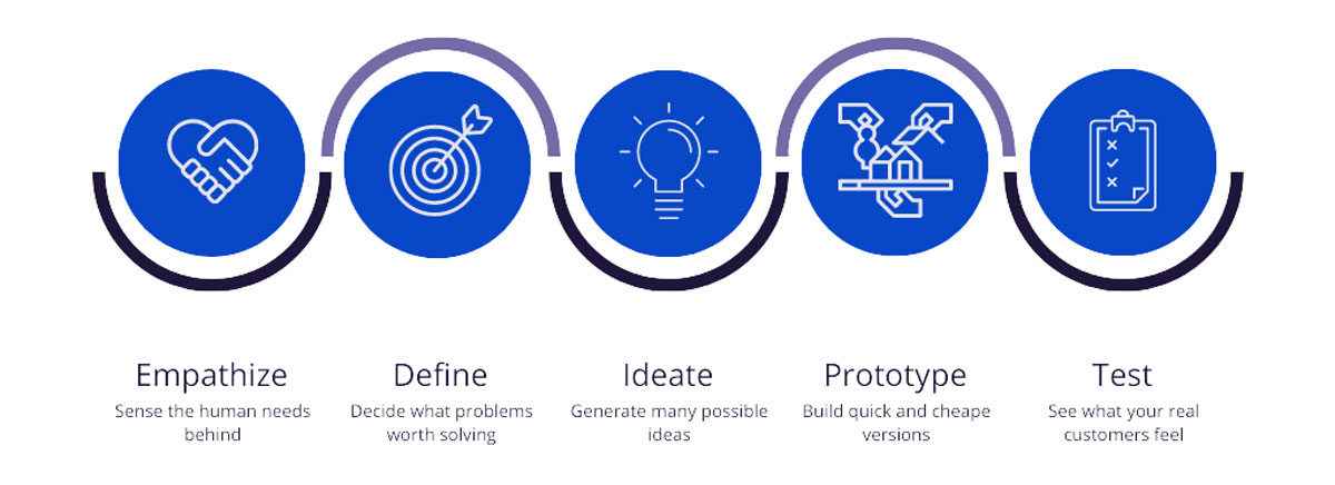
I was hired as the first and only designer on the team to work closely with developers and asset management experts. My work consisted of an Iterative Design Thinking process of Empathising, Defining, Ideating, Prototyping and Testing the main product for both web and mobile applications, as well as working on the sales website and designing the Brand Identity. I have participated in the strategy planning, grooming and retro meetings to share my opinions and ideas about possible approaches in terms of UI development, improvement and delivery of the product in different stages.

Research
We started with a team discussion to better understand business requirements and gather knowledge of PAMCo consultants’ knowledge, expectations and essentials for the MVP and its milestones.
Competitor Analysis
I conducted a competitor analysis on three different applications in this area, namely Infor, SAP and Upkeep. Reviewing the advantages and disadvantages of each application was very useful and insightful in getting more familiar with these types of applications and drawing a better road map to delivering an international enterprise application.
User Research
I had set a couple of goals in mind before conducting user research.
- To understand the reasons why people were opening a CMMS/EAM application.
- Their time spent using the CMMS/EAM and how it fits into their work cycle.
- To identify the number of tasks that should be done by a CMMS/EAM application in a typical workday.
- The features they like/dislike from the CMMS/EAM apps they are currently using.
User Interview
After defining the user research goals, I did some online interviews with the different real target users from various industries and job roles. PAMCo has a good connection with the big industries and factories, and in the process of recruiting people for the user interview, it significantly helped me to find the right people.
Totaly, eight people were recruited for the user interview sessions. Five of them were men with different roles, including overhaul manager, mechanical technician, inspector and transportation head officer. Three of them were women with planning manager, data clerk, and stock manager roles.
Personas
Based on the user interviews, I was able to form two different personas at this stage. We referred to them throughout the entire product development process.
- Educated engineer with a high familiarity with technology and doing repetitive desktop tasks with CMMS/EAM apps.
- Repair and mechanic technician who works with tools and overhauls machines during the day without sufficient knowledge of technology and the internet.


Problem Statement
Asset and maintenance management is an ongoing process that expands over time and makes tracking assets’ history and information challenging. On the other hand, planning and following work orders is a repetitive task. People should do a specific task a hundred times in a working day, so saving only one minute for each task improves the companies’ performance and impacts the employees’ efficiency. However, loads of information, components and actions should be used in asset and maintenance management, which can make the tasks complicated and time-consuming. Knowing this statement, the impact of user experience is recognisable in designing an Enterprise CMMS/EAM application.
DESIGN CHALLENGES
We had complicated challenges because this app has lots of features and logical relations between them. These features should be designed and provided to the users in a comprehensive and usable way. On the other hand, the target users had various internet and software knowledge that made it difficult to make the design decisions and information architecture. The application has to manage many tasks and send data and notifications to the mobile and web apps. In conclusion, designing a consistent web and mobile application with different user personas and various features was the most challenging matter.
Information Architecture
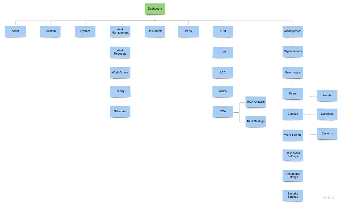
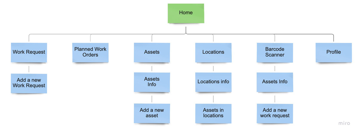
I created two information architecture diagrams based on an open card sorting in collaboration with the PAMCo physical asset management consultants.
- The first information architecture diagram will focus on the SaaS version of the Effectus.
- The second information architecture diagram will focus on the Effectus mobile application.


Design
Since the target market of the Effectus for the MVP was focused on Iran and the design should be compatible with the Farsi language, I should design the RTL version for the development team.
Although I designed the corporate identity of Effectus, I won’t cover branding here but will walk you through a few design decisions I made.
Colour Scheme
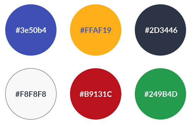
Too many colours can confuse users or draw their attention to less critical areas. For the primary colour, I decided to go with a shade of blue as it is proven to project a trustworthy, reliable, and secure image. In addition, based on colours’ psychology articles, it aligns well with a technological product we were working on. For the secondary colour, I chose orange as it conveys friendliness and confidence. In addition, it makes a sufficient contrast ratio with blue. Black has been selected for the texts, and other colours like red, green, etc., are used for the different states like a warning, success, etc.


Font family
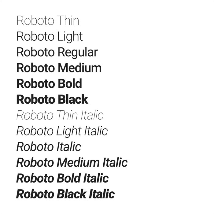
In choosing a suitable font family, many factors are considered. I had to use a single font family throughout the application on both web and mobile to keep the consistency of the application for the users to avoid any distractions. However, the chosen font family should have a variety of font-weight to give the ability to make the textual hierarchies in different scenarios. On the other hand, since operators of the application should perform the majority of the tasks based on the textual contents, the readability of the font family impacts users’ performance.
Roboto has a dual nature. It has a mechanical skeleton, and the forms are essentially geometric. At the same time, the font features friendly and open curves. This makes Roboto suitable for a more natural reading rhythm more commonly found in humanist and serif types.
UI Framework
Based on the user interviews, we identified that the majority of the planning, maintenance and stock managers would be accessing the application through their desktop devices. In contrast, technicians are more comfortable with mobile phone and tablet devices due to their mobility. I evaluated different frameworks and UI libraries to find the most fitting solution in terms of implementation pace, compatibility with responsive design and customisability. Finally, the Bootstrap framework has been picked. Bootstrap helped us develop the application for different screen sizes simultaneously, and it significantly improved the development performance. In addition, Bootstrap allowed us to implement further development more easily and quickly. For example, the dark mode user interface development would be quick without any structural barriers with the Sass extension.
Bootstrap has a variety of built-in components, which is great, but I tried to customise the component during the design process because I found some deficiencies can bring a few problems:
- The usability of some Bootstrap components is questionable and may hurt the experience.
- The product loses its personality by being too similar to any other app made with Bootstrap, which may lead to trust bias. I didn’t want to risk that when building an Enterprise application, so I made different visual changes.
Low-fidelity prototype
Paper prototyping is an easy way to help UX designers quickly iterate and explore design ideas. I used paper sketching to address different ideas considering user barriers and business needs rapidly. Every feature we worked on was started with a brainstorming meeting with the participation of asset management specialists, developers, the product manager and me as a user experience designer to realise their visions about the expected feature. I always tried to draw some initial sketches of the product manager’s vision to make the technical subjects visual and more comprehensive.
Some sketches of the initial product manager’s vision are shown below:
The first two days of each sprint were spent on designing rectified sketches based on users’ needs, the outcomes of the brainstorming sessions and user experience best practices.
Some examples of sketches for both web and mobile applications are shown below:
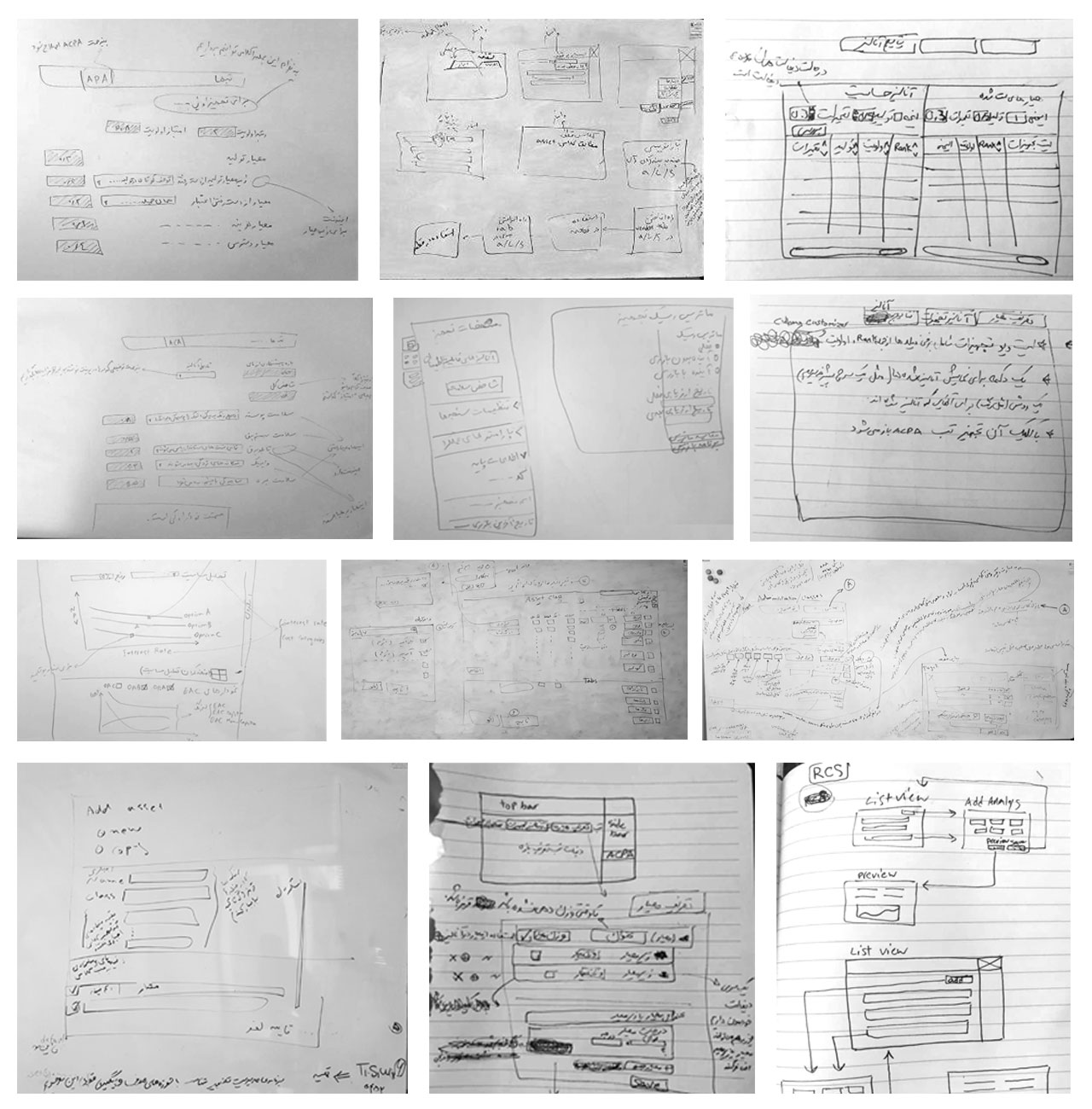

Product manager's vision, a brainstorming session
![[Untitled]_9-9 https://abbasabadi.co.uk/wp-content/uploads/2021/08/Untitled_9-9.jpg](https://abbasabadi.co.uk/wp-content/uploads/2021/08/Untitled_9-9.jpg)
![[Untitled]_9-9 https://abbasabadi.co.uk/wp-content/uploads/2021/08/Untitled_9-9.jpg](https://abbasabadi.co.uk/wp-content/uploads/2021/08/Untitled_9-9.jpg)
Sketches of Dashboard view, expanded and collapsed Side menu and Topbar navigation
![[Untitled]_7-9 https://abbasabadi.co.uk/wp-content/uploads/2021/08/Untitled_7-9.jpg](https://abbasabadi.co.uk/wp-content/uploads/2021/08/Untitled_7-9.jpg)
![[Untitled]_7-9 https://abbasabadi.co.uk/wp-content/uploads/2021/08/Untitled_7-9.jpg](https://abbasabadi.co.uk/wp-content/uploads/2021/08/Untitled_7-9.jpg)
Sketch of Asset's detail page
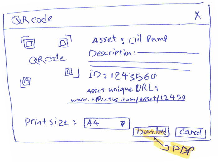

Asset's QR Code settings
![[Untitled]_8-9 https://abbasabadi.co.uk/wp-content/uploads/2021/08/Untitled_8-9.jpg](https://abbasabadi.co.uk/wp-content/uploads/2021/08/Untitled_8-9.jpg)
![[Untitled]_8-9 https://abbasabadi.co.uk/wp-content/uploads/2021/08/Untitled_8-9.jpg](https://abbasabadi.co.uk/wp-content/uploads/2021/08/Untitled_8-9.jpg)
Asset's list view and add asset modal sketches
![[Untitled]_1-9 https://abbasabadi.co.uk/wp-content/uploads/2021/08/Untitled_1-9.jpg](https://abbasabadi.co.uk/wp-content/uploads/2021/08/Untitled_1-9.jpg)
![[Untitled]_1-9 https://abbasabadi.co.uk/wp-content/uploads/2021/08/Untitled_1-9.jpg](https://abbasabadi.co.uk/wp-content/uploads/2021/08/Untitled_1-9.jpg)
BI statistical dashboard sketch
![[Untitled]_6-9 https://abbasabadi.co.uk/wp-content/uploads/2021/08/Untitled_6-9.jpg](https://abbasabadi.co.uk/wp-content/uploads/2021/08/Untitled_6-9.jpg)
![[Untitled]_6-9 https://abbasabadi.co.uk/wp-content/uploads/2021/08/Untitled_6-9.jpg](https://abbasabadi.co.uk/wp-content/uploads/2021/08/Untitled_6-9.jpg)
Sketch of Planing calendar view
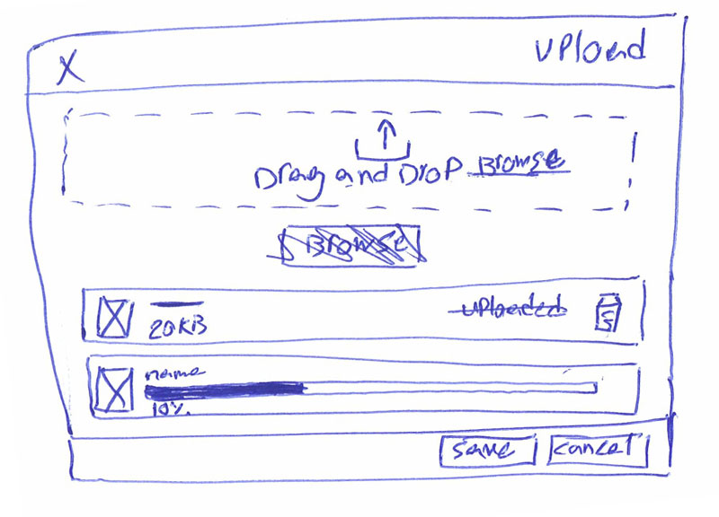

File upload modal
![0[Untitled]_3-9 https://abbasabadi.co.uk/wp-content/uploads/2021/08/0Untitled_3-9-1.jpg](https://abbasabadi.co.uk/wp-content/uploads/2021/08/0Untitled_3-9-1.jpg)
![0[Untitled]_3-9 https://abbasabadi.co.uk/wp-content/uploads/2021/08/0Untitled_3-9-1.jpg](https://abbasabadi.co.uk/wp-content/uploads/2021/08/0Untitled_3-9-1.jpg)
Sketches of Asset's detail and Profile page in mobile app
![[Untitled]_2-9 https://abbasabadi.co.uk/wp-content/uploads/2021/08/Untitled_2-9.jpg](https://abbasabadi.co.uk/wp-content/uploads/2021/08/Untitled_2-9.jpg)
![[Untitled]_2-9 https://abbasabadi.co.uk/wp-content/uploads/2021/08/Untitled_2-9.jpg](https://abbasabadi.co.uk/wp-content/uploads/2021/08/Untitled_2-9.jpg)
Sketches of Barcode scanner, Welcome and Login pages in mobile app
![[Untitled]_4-9 https://abbasabadi.co.uk/wp-content/uploads/2021/08/Untitled_4-9.jpg](https://abbasabadi.co.uk/wp-content/uploads/2021/08/Untitled_4-9.jpg)
![[Untitled]_4-9 https://abbasabadi.co.uk/wp-content/uploads/2021/08/Untitled_4-9.jpg](https://abbasabadi.co.uk/wp-content/uploads/2021/08/Untitled_4-9.jpg)
Sketches of the Home page, Navigation bar, Data entry view and List view in mobile app
High-fidelity prototype
In each sprint, once we reviewed the sketches and rectified the practical issues, I started designing the final screens in Adobe XD. Developing the Hi-Fidelity prototypes helped the team in different aspects. First, developers had an excellent source to estimate the sprints’ scope and technical needs. On the other hand, this source helped them implement the application faster, more consistent and more usable. Secondly, the Hi-Fidelity prototype helped evaluate the application’s usability in an actual condition through the testing sessions before the development phase. The Hi-Fidelity prototype was a good tool for the marketing team to show the unimplemented parts of the application’s features to the customers.
Due to project confidentiality, I am unable to share the interactive prototype link but will walk you through a few key page screenshots.
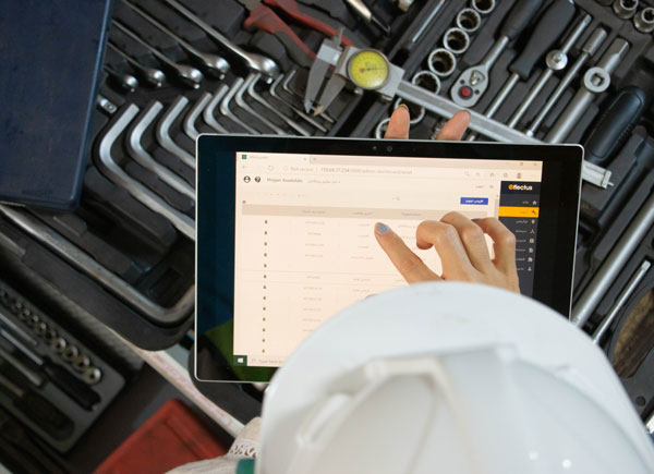

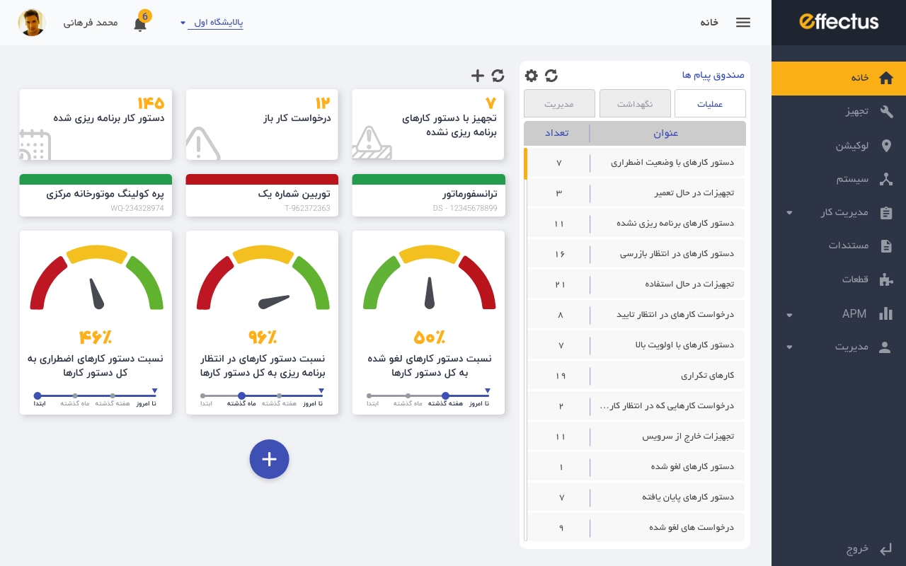

The final design of the Dashboard with different KPIs
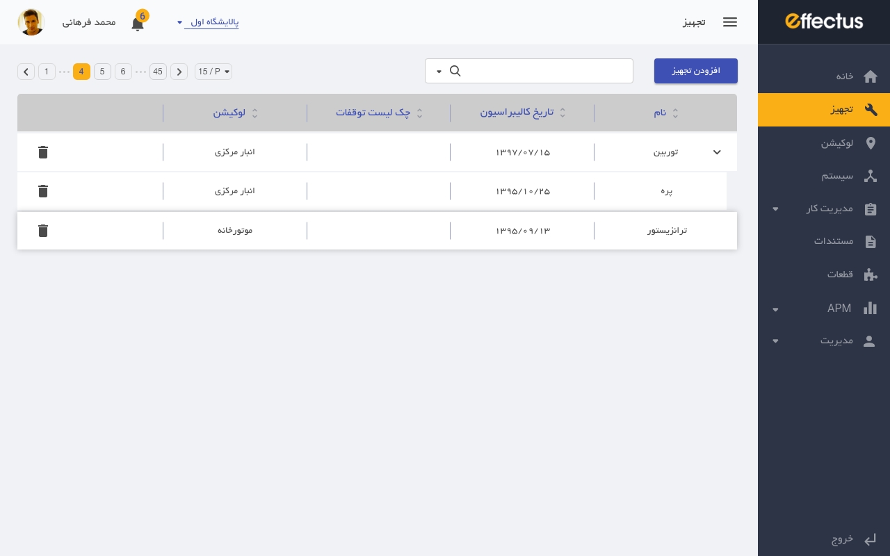

An example of the list view which is used in many sections
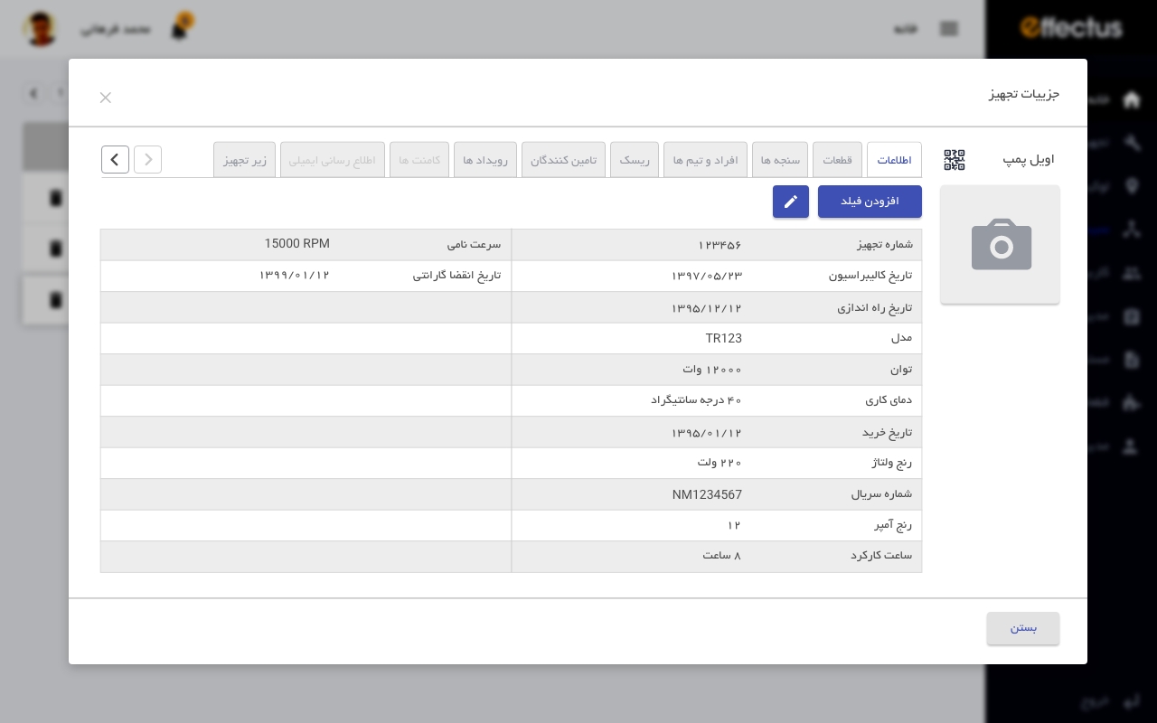

The final design of the Asset detail page
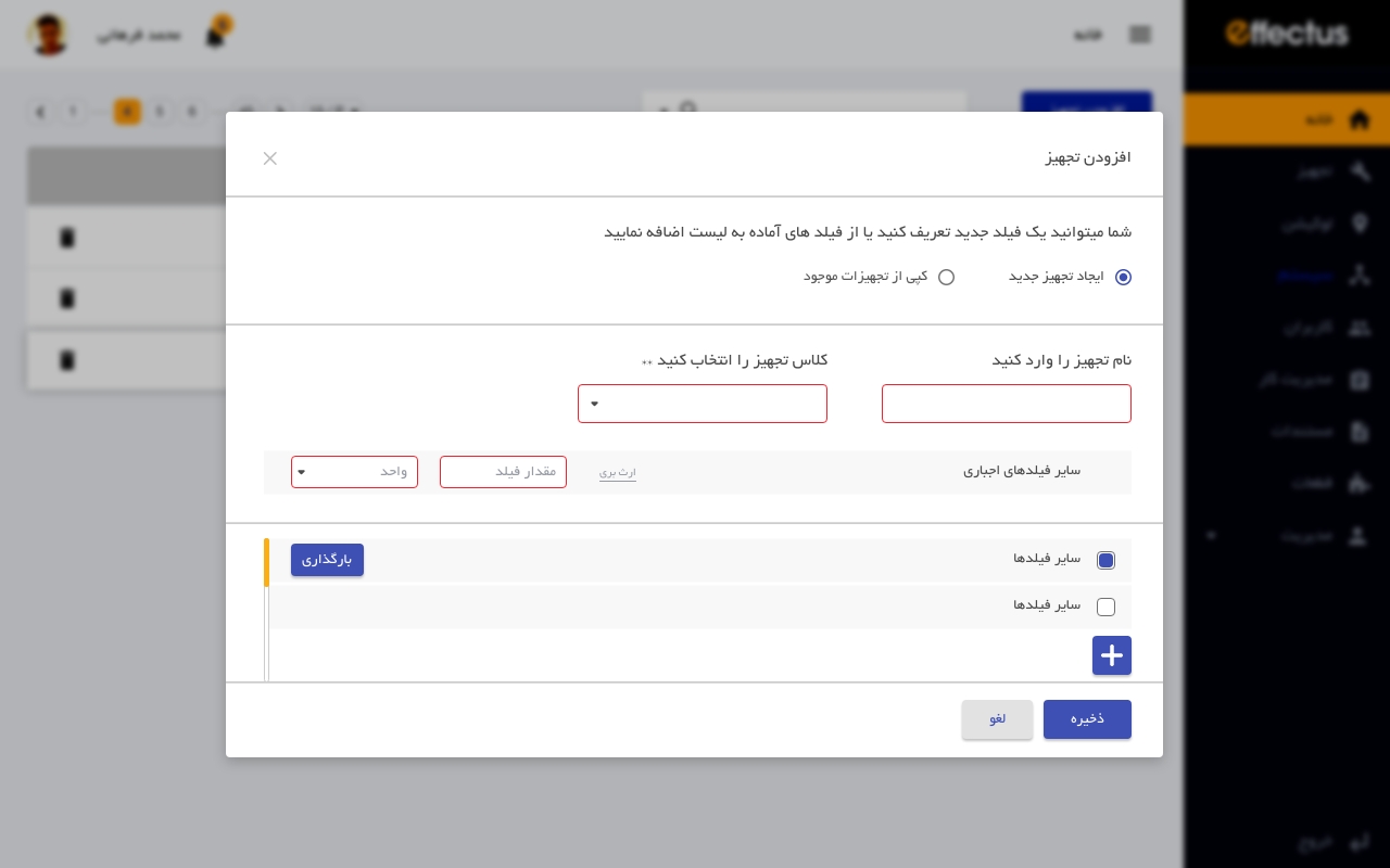

An example of the add a new data (new asset)
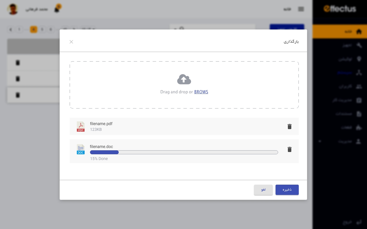

The proposed modal for the file upload to the system
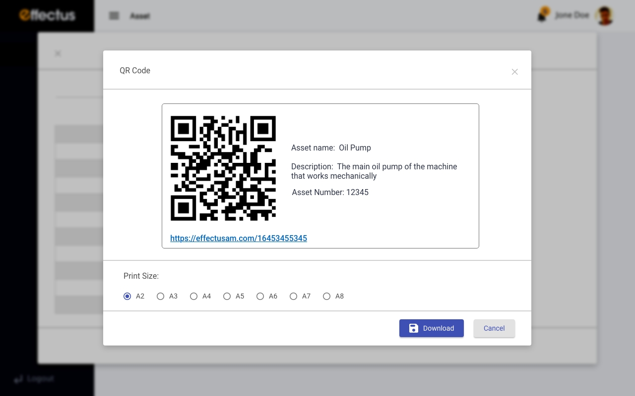

The design of the QR Code generator
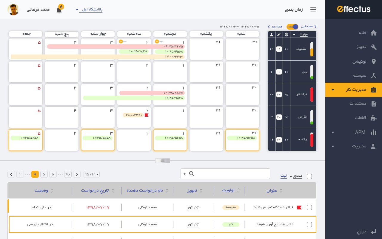

The final design of Scheduling calendar
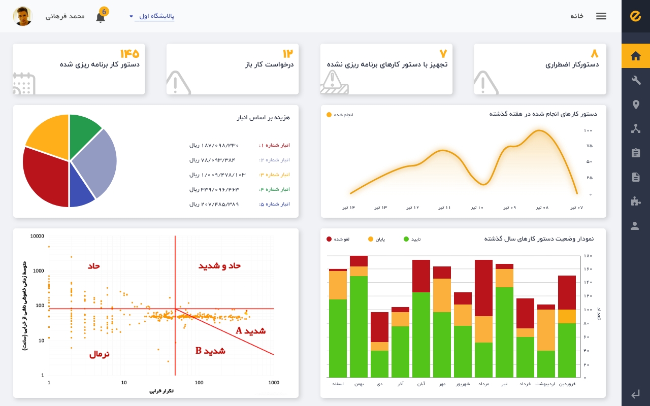

The final design for the Business intelligence dashboard (BI)
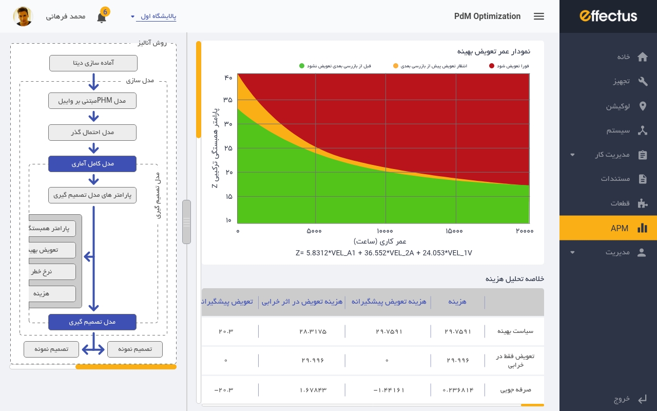

The design of PM Optimisation graphs
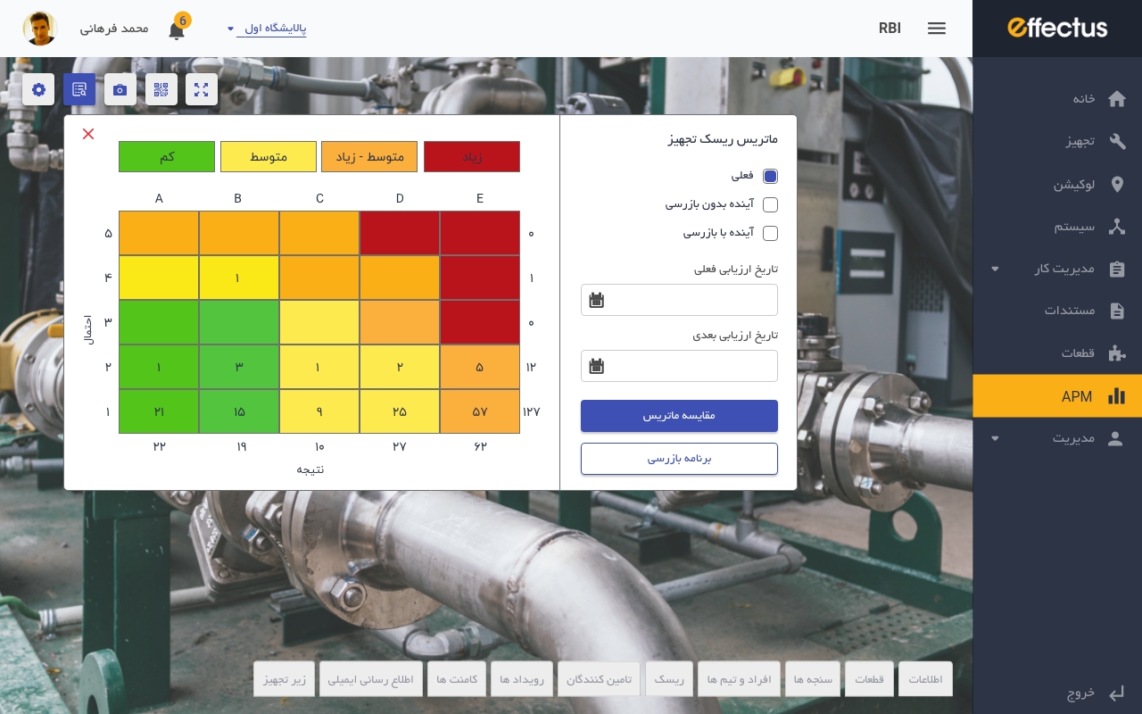

The solution for the Risk-Based Inspection page
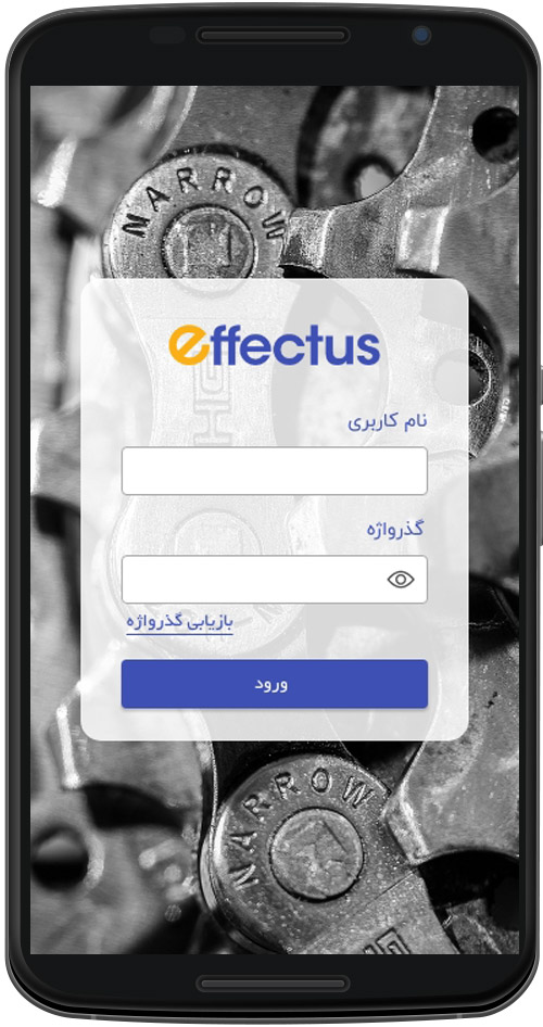

Login page in mobile app
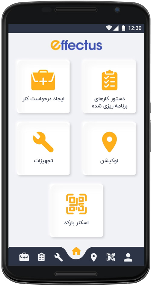

The proposed home page for mobile with accessible shortcuts
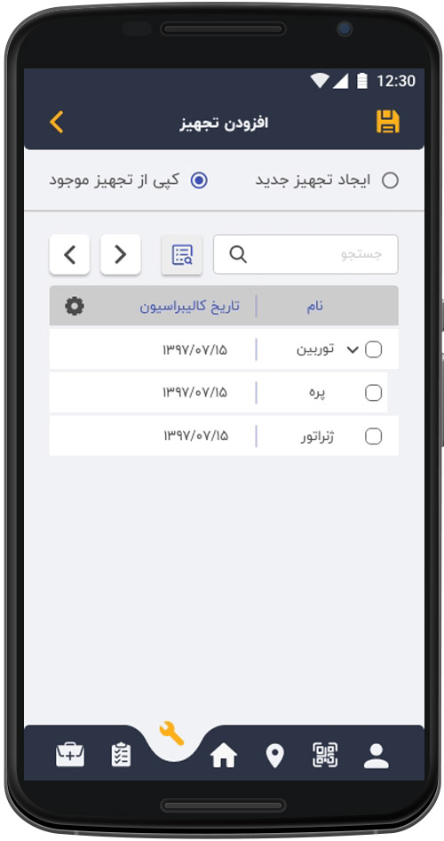

The compatible list view for the mobile app
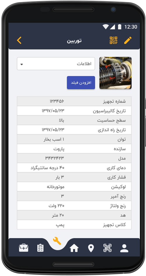

The proposed solution for the asset detail with the same features on mobile app
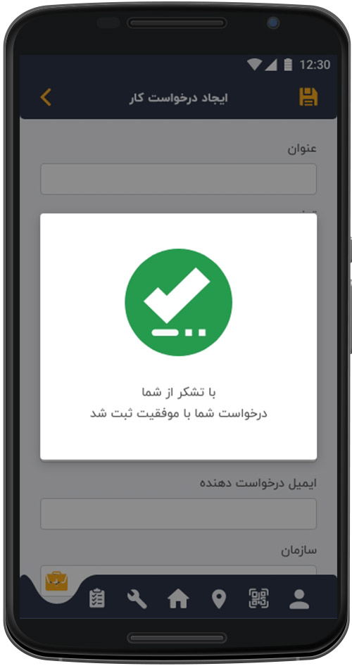

Successful message in mobile app
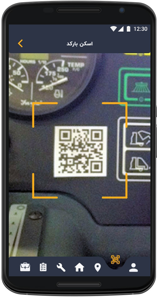

An example of barcode scanner view
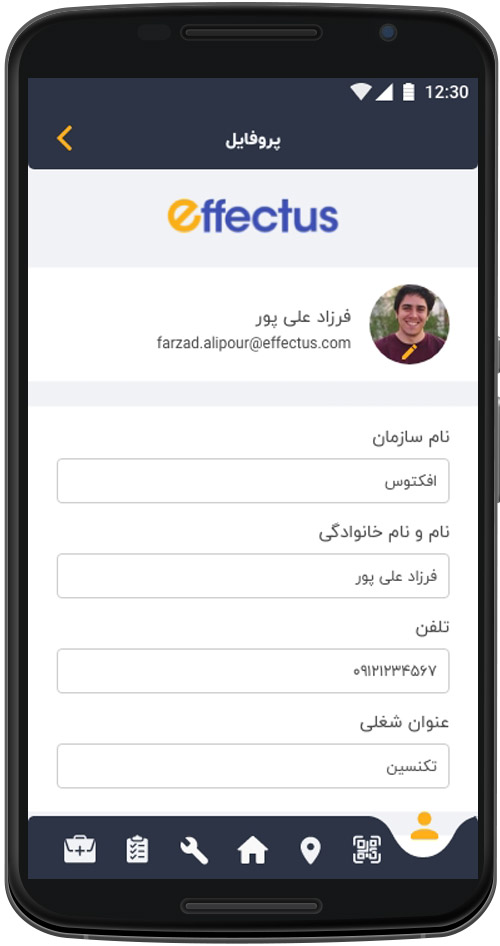

The final design of the profile page in the mobile app


The video of the interactive prototype mobile application
Usability Testing
Testing method, aim and objective
Before delivering the prototype to the development team in each sprint, I did a testing round in order to indicate possible usability problems. In terms of methodology, mostly I used a mixed-methods to gather both quantitative and qualitative data based on the feature that I tested. Due to the COVID-19 circumstances, I took the moderated remote testing via Microsoft Teams approach with the actual users recruited by PAMCo specialists. Each phase of the usability test is aimed to evaluate the prototype with at least 4 participants. The think-aloud protocol was applied to all usability testing sessions.
Testing Process
Introduction:
- Welcoming chats
- Introduced myself and other audiences in the meeting
- Explained the concept of planned features for the test
- Explained the test aims to evaluate the product’s usability, not the users’ ability
Tasks:
- Described the general scenario based on the tested feature
- Showed the relevant screen to the user and explained the tasks or questions
Data gathering:
- Based on the tested feature, gathered quantitative data, including task completion time, usability score, error rate, etc.
- Gathered qualitative data, including users’ thoughts, expectations, suggestions and questions.
- Tried to drive the meeting to an open-ended chat to get more feedback and, in the end, appreciate users’ participation.
Conclusion:
- Evaluated different users’ performance, comments and barriers.
- Identified product’s bottlenecks and usability issues.
- Rectified prototype based on testing sessions’ outputs.
- Delivered a usable prototype to the development team.
Findings
Since the project’s scope was too broad, we conducted multiple usability testing sessions for different features and based on the finding from each round of tests, I modified the prototype. There are dozens of rectified design examples as a result of several usability tests that we conducted throughout the project, which are beyond the scope of this portfolio. To show the result of the usability tests for this project, I will discuss some examples of key findings and the changes has been made.
Insight Identification
Finding 1
Participants were stocked to the work order list view by the lack of an accessible users’ location indicator.
Finding 2
The user group access definition in the admin panel was frustrating since all of the checkboxes should be selected to give full access.
Finding 3
Participants were not sure about the remaining time of each technician while they tried to schedule the next week’s maintenance program due to the lack of sufficient information in the planning calendar.
Modification 1
During the 5th sprint, we tested the work order and work request features. 4 out of 6 participants got stocked on the work order list view, and they could not go back to the work request page. We assumed that people would realise that they could easily click on the dashboard menu to start from the beginning.
As a result of this round of usability tests, we added a breadcrumb to the navigation bar to help people find their location on the application based on the WCAG 2.4.8: Location.


The tested version


A breadcrumb added to the navigation bar
Modification 2
In the 11th sprint, we tested the admin menu for the application where the admin can give access to different features for defined user groups. 4 participants tested the feature, and as a result of the think-aloud protocol and user comments, we found the process of selecting checkboxes frustrating for the users. They mentioned that a procedure to select multiple items would improve their performance and satisfaction. I examined different applicable approaches, and finally, I decided to put two other checkboxes on the tables. The red highlighted one in the picture below allows the admin to give full access to all tabs for a specific user group, while the green highlighted checkbox only gives the full access to the selected tab.
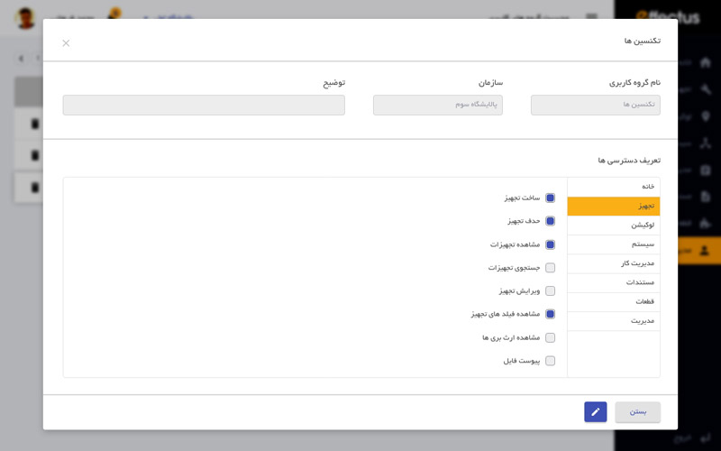

The tested version
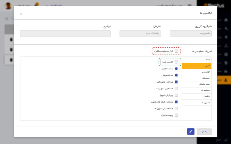

The red highlighted check box gives the full access to all tabs's feature
The green highlighted check box gives the full access to the selected tab's feature
Modification 3
In the 17th sprint, we evaluated the planning calendar with 7 participants. This screen allows the planning manager to schedule next week, month or year maintenance programs. During the test, I released that users should get back to the dashboard each time they want to assign repetitive work to a user group to check the remaining time for that specific profession. I designed a remaining time progress bar for each profession in the calendar. The quantitative data from the second round of the usability test showed that users performed the same task 23% faster than the old version.
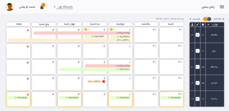

The tested version
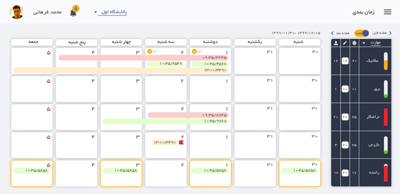

The modified design with the remaining time progress bar for each profession
Results and takeaways
The product received much attention in the Iran and Middle-East countries. At the moment, several big industries in the area of Manufacturing, Oil & Gas, Food and others are using the Effectus in their work cycles.
As soon as the beta version was released, the project won the nation’s knowledge enterprise award and fund.
Some key takeaways from this project are:
- Designing in the Enterprise scop: When you design for an enterprise product, any design decisions impact users’ and industries’ performance, safety, confidence and revenue. Many research, user interviews and usability test are needed to ensure the product usability.
- Pure User Experience: We built a product for a specific audience that values functionality over the look and feel and has certain expectations and goals. The users’ performance had an impact product’s success.
- Collaboration in technical decisions: I experienced working in a small agile team which allowed us to move faster without noticeable compromises either on the design or tech side. We managed to introduce a significant amount of features compared to what the industry operates with today. There were many challenges to overcome in a short amount of time when building certain elements that are subject to industry regulations.
- Development is not the final step: I deeply understood the importance of user research and user testing in the process of designing, developing and maintaining a product. A developed and workable product is not a completed one. It needs an iteration in understanding the user, rectifying the design, and improving the usability of the product until the users use it.
